Using Your Brand Colors in Microsoft Office Documents

If your brand identity has been created, you're excited to incorporate all of the beautiful elements into every part of your business (as you should be!). But what happens when you need to send a Microsoft Word document to a potential client and the only colors that seem available are Word's default colors? You might choose a color that kinda matches that sage color in your logo, or you might calculate how much it's going to cost to have your designer create the document for you, or you might say "piece of cake!" and use your exact brand colors to keep everything you send to clients seamlessly cohesive.

Do you want to learn how to add your brand colors into Microsoft Word and PowerPoint? This simple tutorial will show you how! Via Deilghted Creative Co. | delightedco.com

If you answered anything but the latter, read on. There is a simple process that will allow you to easily update your Microsoft Office documents with your brand colors.

Use Your Brand Style Guide

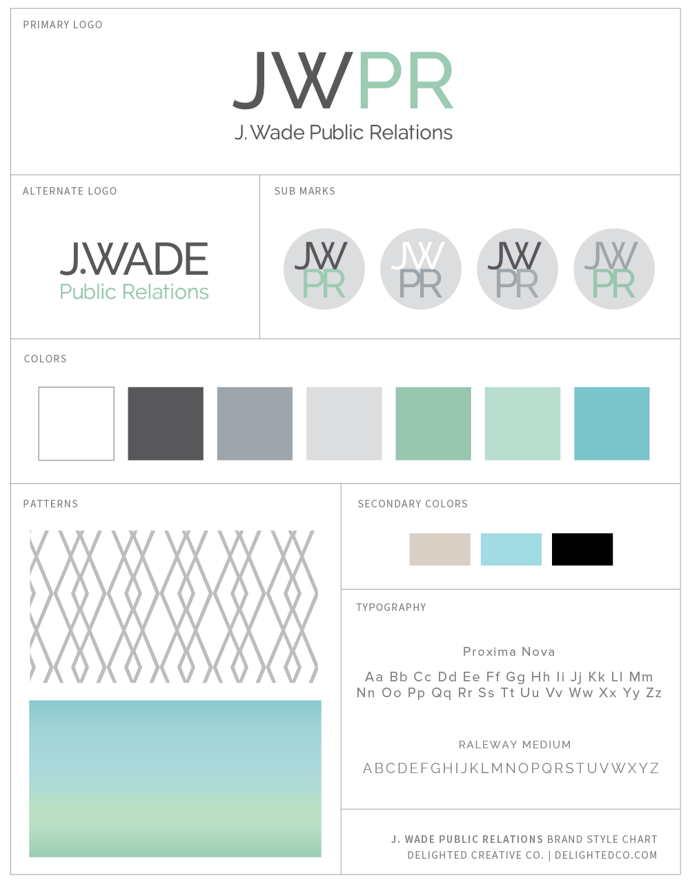
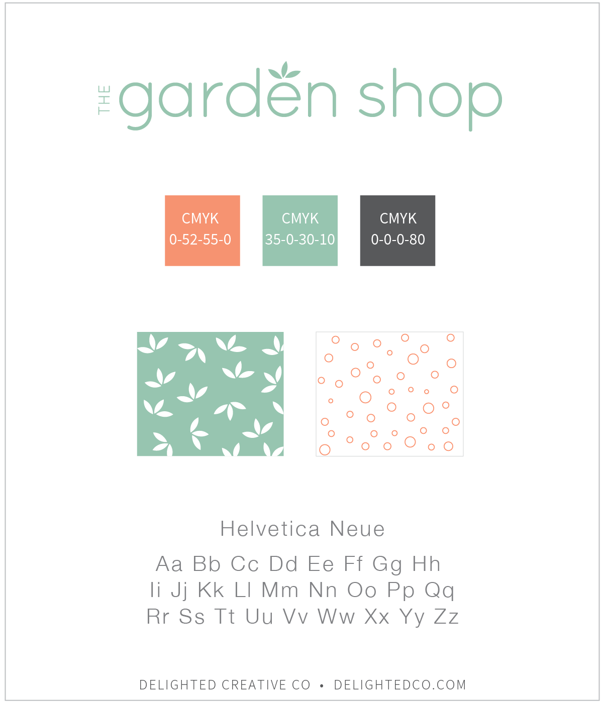
First, you will need your brand style guide as a reference. This is the information your designer creates and gives you when your brand identity is complete. For each color in your brand's color palette, the style guide provides either a CMYK, RGB, or HEX code—or all of the above. These codes provide you with color information you can use in most any program, including Microsoft Office programs. Your guide may look something like this:

Do you want to learn how to add your brand colors into Microsoft Word and PowerPoint? This simple tutorial will show you how! Via Deilghted Creative Co. | delightedco.com

The Five Steps

For the purpose of this tutorial, let's assume you have the CMYK color code for that sage green color you're looking for. In this instance, it's C-35, M-0, Y-30, K-10.

1 - Highlight the words in the document that you want to re-color
2 - On the Home tab, choose the "A" icon also known as the Font Color tool and click "More Colors..."
3 - In the Colors bar, choose the slider option and use the drop down to choose CMYK
4 - Type in the CMYK color code on your brand style guide and hit OK
5 - Ta da! Your type is now recolored to the exact color in your logo


1  •  Highlight the words in the document that you want to re-color

Adding Brand Colors to Microsoft Office || Delighted Creative Co.

2  •  On the Home tab, choose the "A" icon, also known as the Font Color tool and click "More Colors..."

Using Brand Colors in Microsoft Office || Delighted Creative Co.

3  •  In the Colors bar, choose the slider option and use the drop down to choose CMYK

Using Brand Colors in Microsoft Office || Delighted Creative Co.

4  •  Type in the CMYK color code on your brand style guide and hit OK

Using Brand Colors in Microsoft Office || Delighted Creative Co.

5  •  Ta da! Your type is now recolored to the exact color in your logo

Using Brand Colors in Microsoft Office || Delighted Creative Co.

And there you have it! Super simple.

• • • • • • • • • • • • • • • • • • • • • • • • • • • • • • • • •
Note: this works exactly the same in PowerPoint. Let me know if you have any questions.

What I'm Learning: 3 Online Resources that Helped Me Improve My Brand Design Process

Ahh...the world of brand identity and graphic design. There is so much to learn and I’m forever taking it in and refining my process for the better with each new project.

Three online resources that helped me improve my brand identity design process • Delighted Creative Co.

I didn’t go to school for design, although sometimes I wish I had. My first taste of graphic design was in a middle school “Advanced Tech” class (hello Macintosh SE) and a computer arts class where we used some sort of drawing software to make “computer art” all period long, every day. As much as I enjoyed these classes, I never considered Graphic Design as a career. Instead I majored in Communication studies with an emphasis in Advertising and Public Relations. I did take Graphic Design for Advertising, Desktop Publishing, and a few other design-related courses, but to me, these were bonus classes and I never thought I’d use graphic design skills regularly in my work.

However, that’s exactly what I ended up doing. Not on a large scale, but for projects here and there, in all of my jobs since college. When I worked in a hotel sales office, I designed fliers and email promotions for travel industry partners. In my job at the wedding magazine, I helped our designer with the magazine layout and designed ads for clients as well as promotional pieces for our brand. In my job at an architecture studio I worked on multi-page marketing proposals, and in my current role I design invitations, agendas or other event collateral. I truly enjoy these projects and am glad (and a little surprised) those initial design classes turned out to be so useful.

Because I have more workplace experience than classroom experience, I am intrigued by graphic designers with four-year degrees who are freelancing full-time or working at a design studio. They have been through grueling coursework, peer reviews, and have taken classes like Art History, Color, and Typography. Because they've experienced a depth of learning in this field that I haven't, I am always looking to discover their secrets and best practices.

Thankfully we have the opportunity to learn pretty much anything, anytime, anywhere from experts in most fields. Insightful podcasters freely share their knowledge, online classes taught by masters of their crafts are available from the comfort of our homes, and online communities allow us to learn from amazingly talented people.

I have taken advantage of my fair share of podcast episodes...daily storing away gems of knowledge. I purchase classes from designers I respect, and am part of online forums where I’ve been able to learn from designers and small-business owners with a deep knowledge and expertise. These podcasts, classes, and forums are inspiring and super helpful as I am working towards developing my own design process and expertise.

If you are in a similar situation, wanting to learn best practices from designers online, here are three of my favorite design-related educational investments and why I recommend them.

Skillshare Brand Identity Design Course Recommendation by Delighted Creative Co.

SKILLSHARE

I can’t get enough of this site. One of the first courses I took on Skillshare was Courtney Eliseo’s class called Beyond the Logo: Crafting a Brand Identity. It was a total game changer for me. My eyes were opened to the world of brand design and this course made everything “click”. I had been designing for a while and knew there was more to a logo than the logo itself, and I knew about complementary fonts, submarks and brand guidelines, but wasn’t sure how to put all those pieces together. After her class, it made sense. Getting a behind-the-scenes peek at her full brand creation process was beyond helpful as I started working on brand identity projects myself.

My top two takeaways from this course:

1  •  The Client Questionnaire. After reviewing Courtney’s questionnaire, I was able to better understand the importance of a clear and well thought out client questionnaire. The questionnaire part of the branding process is the foundation for the design because it gets to the heart of the company and it’s owner. The more detail and thought a client puts into her answers, the better equipped a designer is to create an identity that reflects the client and her dream customers. I now have an in-depth questionnaire of my own that I’ve found helps me get to know my clients and their needs. And that is what ultimately helps me design a logo that is both beautiful and meaningful.

2  •  Logo Option Mockups. Courtney recommends using mockups to show logo options to her clients. For example, she will create a sample postcard or notecard with the logo and pattern she’s designed so her client can see the possibilities the logo provides. This might be something standard in the industry, but for me it was new and something I started implementing right away.

Be Free, Lance: An Online Course for Freelance Designers | Recommended by Delighted Creative Co.

BE FREE, LANCE

Breanna of Rowan Made and Jen of Serafini Creative have an e-course called Be Free, Lance which is a place for designers to learn the ins-and-outs of freelance. With content based on their years of experience as designers, the course provides an inside look at their processes and provides insights on everything from setting goals to getting clients to client management.

Included with the purchase of the course is an invitation to the private Facebook group which I’ve found to be the most valuable Facebook group I am part of (I’m in a handful of them). If you’re a designer wanting to learn from other designers, you’ll find lots of great info in this group. Not to mention that Breanna and Jen are very active and answer questions all the time which is so helpful.

Be Free, Lance now has Mini Courses which are great as well. I joined “The Branding Process” mini course which provides a detailed overview of Breanna and Jen’s branding processes. The examples and downloads provided are super helpful as I continually refine my own process.

My top two takeaways from this course:

1  •  Brand Strategy Overviews. It has been my experience that small business clients can often benefit from having a written brand strategy that outlines who they are, who their clients are, and what their business is about. After learning the way Breanna puts a strategy together for her clients, I have been able to adapt and do something similar for mine. It’s amazing how much it centers the project and gets my client and me on the same page before the design begins.

2  •  Provide a Maximum of 2-3 Logo Options.  Every designer needs to figure out what works for her when it comes to how many logos she provides to her clients: one option, two or three options, or 10 options! I've struggled to find the right amount with my clients until recently.

Sean McCabe of seanwes (one of my favorite podcasts), says something like: "your client is paying you to come up with a solution. Don't have her do your work by making her choose from multiple options. Create a solution and give it to her." He strongly believes in the one option scenario.

There are others who send their clients 8-12 logo options. That's a lot! I've done it this way a couple of times and it was fun because I had plenty of ideas and really liked how they were looking and feeling. But if I'm figuring out what works for my client and why, I need to do the work of narrowing down the number of choices and provide her with the best solution. Thanks in part to the Branding Mini Course, I am understanding the strategic part of design even more and will be sticking with providing 2-3 options that will work best for my client and explaining why those options are best.


Freelance Wisdom: Client Branding 101 eBook Recommendation from Delighted Creative Co.

CLIENT BRANDING 101 EBOOK

Jess Levitz of June Letters Studio wrote an eBook called Freelance Wisdom: Client Branding 101 which was another great buy. I bought her eBook at a point where I had a pretty good idea of how I liked working with clients, but wanted another perspective. Jess has been freelancing for a few years and has a great style, so the opportunity to look into her design process was really helpful.

The eBook is a 40-page download and if you buy the expanded version, you can also get moodboard templates and a sample questionnaire. As I mentioned, the client questionnaire is key to the success of a brand identity project and it’s always fun to have a peek at the questions other designers use to get to know their clients.

My top two takeaways from this eBook:

1  •  Grayscale Logo Options. Jess provides logo options to clients in grayscale. She says doing so keeps her clients from being distracted by colors and instead makes it easier for clients to give meaningful feedback on the logo itself as well as to do side-by-side comparisons with the other options. I have heard mixed thoughts on this but knowing she uses the grayscale option for her clients has me giving it a second thought. I will likely try this in the near future.

2  •  Sketch Over a Couple of Days. Jess recommends putting aside two days for sketching logo ideas. She carries a sketchbook wherever she goes during this phase of the design process and will take it out when she sees something that sparks an idea. Instead of limiting myself to a few hours for sketching and concept creation, I may try this more organic process and give myself two full days to sketch as inspiration comes throughout the day.

So while I have yet to put all of these best practices into place, I appreciate the opportunity to expand my view on the way the branding process can work by learning from other experts in the design field. Each process is different with the same end result: a great brand identity that reflects the client and the client’s ideal customer.

Isn’t it amazing what we are able to learn from each other online? Let me know if you have a favorite online design course or eBook...I’d love to check it out!

How to Add a Favicon to Your Squarespace Website

When you're on a website, have you ever wondered about those little icons on the tab of your browser window? They add some fun to the tab and make a website seem complete—like a pretty stamp on an envelope. I always feel like something is missing when a site doesn't have one.

Learn how to create a favicon and add it to your Squarespace website. Click through for the 6 easy steps to add this small, but impactful detail to your site. | Tutorial by Delighted Creative Co.

As much as I notice them, and oddly care about them, there was a time when I didn’t know what they were called or how they got there. I had no idea how to build a website either so it didn’t really matter. But then I took an Adobe Dreamweaver class and was sitting by a girl who knew quite a bit about coding and website terminology. She seemed like the perfect person to get insights from. So I asked her.

“It's a favicon.”

“I'm sorry...a what?"

“Fav-i-con.”

“Oh, thank you. And how does it get there?”

“You have to add it.”

And she turned aside. So the conversation was over, but at least I knew what they were called—and I had Google.

Favicons. They’re tiny but impactful.

If you love details as much as I do and you want to be sure you don't miss an opportunity to brand your site in this way, I'll show you how to make one! It’s pretty straight forward and Squarespace makes it unbelievably easy to add to your website.

Let's get started. First, we'll talk about size and style parameters.

SIZE

Favicons are small with a final size of 32-pixels by 32-pixels. Because of the size, a simple design is ideal. Consider using a brand submark or the first letter of your logo or any symbol that you regularly use in your branding. Whatever it is, the less complicated the better. However—you should feel free to use something that's a bit complex if it fits nicely in a square area. For example, the Starbucks favicon in my round-up below is detailed, but works because it's not too tall or too wide.

STYLE

• Submark •
A great option is using a submark provided by your designer or any design that is clearly part of your brand identity. As I mentioned above, the most ideal favicons are simple and recognizable, considering they are quite small.

• Type, Shape and Color • 
If you don’t already have a submark that would work well, consider using a square block of color or a simple shape that reflects your brand: would a star, heart, diamond, or circle be applicable to your brand style? Or how about the initials of your company name? Here are some favicons to inspire you:

LET'S MAKE ONE!

I use Adobe Illustrator when I create favicons for myself or for my clients, but you can also use Photoshop, or Canva, which is free. Here is how I created the favicon for my site:

Step 1 • Open a new 100px square artboard in Illustrator

Step 2 • Create the shape you want as a background. I chose a circle, but again, choose what works best for your brand. There is no need to add a background shape if you don’t want one.

Step 3 • Type the letter(s) you want to include and resize to fit over the shape

Step 4 • File > Save For Web > Choose PNG > Type Optimized if you have text. If you want to remove the white background, check the Transparency box.

Step 5 • Navigate to your Squarespace account > Choose Design > Logo & Title

Create a Favicon for Your Squarespace Website | Tutorial by Delighted Creative Co @delightedco

Step 6 • Upload your Favicon and Save

And that’s it!

Note: it can take a few minutes for your favicon to show up—you may need to refresh your web browser a couple of times (Command + R), or even close it out and reopen.

Let me know if you have any questions!

Recent Work: J. Wade Public Relations

I had the pleasure of working on a new brand identity and website design project for Jenn Wade before maternity leave and I'm excited that her site is now up and running!

When we first connected, Jenn was in the process of starting her own PR firm and had a good idea of what she wanted: a brand identity and website that was modern and bold with personality. She and her team are seasoned experts in their field and have extensive experience to benefit their clients, which shows in her portfolio and in the broad range of services she provides.

Visit her website at jwadepr.com and let me know what you think!

Delighted Creative Co. Brand Style Guide #branding

If your small business is in need of a brand identity and website that tells your story, let's work on it together! Visit my Design Services page and send me a note to get started.

Recent Work: The Sugar Studio

Hi there! I hope 2015 is off to a great start in your world.

I'm excited to share a project I've been working on that is now live: the brand identity and web design for The Sugar Studio! The woman behind The Sugar Studio is Hilary: chic, girly and all-around fun. She not only creates stylish (and delicious) cakes and pastries, but also offers fun classes for anyone interested learning her secrets.  Check her out here...you won't be disappointed.

Hilary was looking for a clean, soft and modern feel for her identity, and I think what we ended up with is just that.

Moodboard image credits (starting at top left): 1, 2, 3, 4, 5, 6, 7, 8

Moodboard image credits (starting at top left): 1, 2, 3, 4, 5, 6, 7, 8

The Sugar Studio Brand Style Guide by DelightedCo.

If you're looking to re-brand your creative business, I'd love to help! Visit my Design Services page for more info.