


Creating your space on the internet is both exciting and challenging. Your website is a place for your dream clients and customers to find out more about you and to hopefully do business with you, so you want to ensure that your site is not only beautiful, but practical, professional, and easy to navigate. It’s no small task! I still have things I want to do to my own site to improve it’s functionality and look, so I understand the struggle. Here are ten things to consider as you set up your new site or work to improve your current one.

1 • WHITE SPACE
White space is like a breath of fresh air. It’s pretty much exactly what it sounds like: the blank space on your website that surrounds your text and images. It creates a clean and uncluttered feeling on your page and helps provide a sense of direction to your visitor. Look at the two examples below.
EXAMPLE 1:
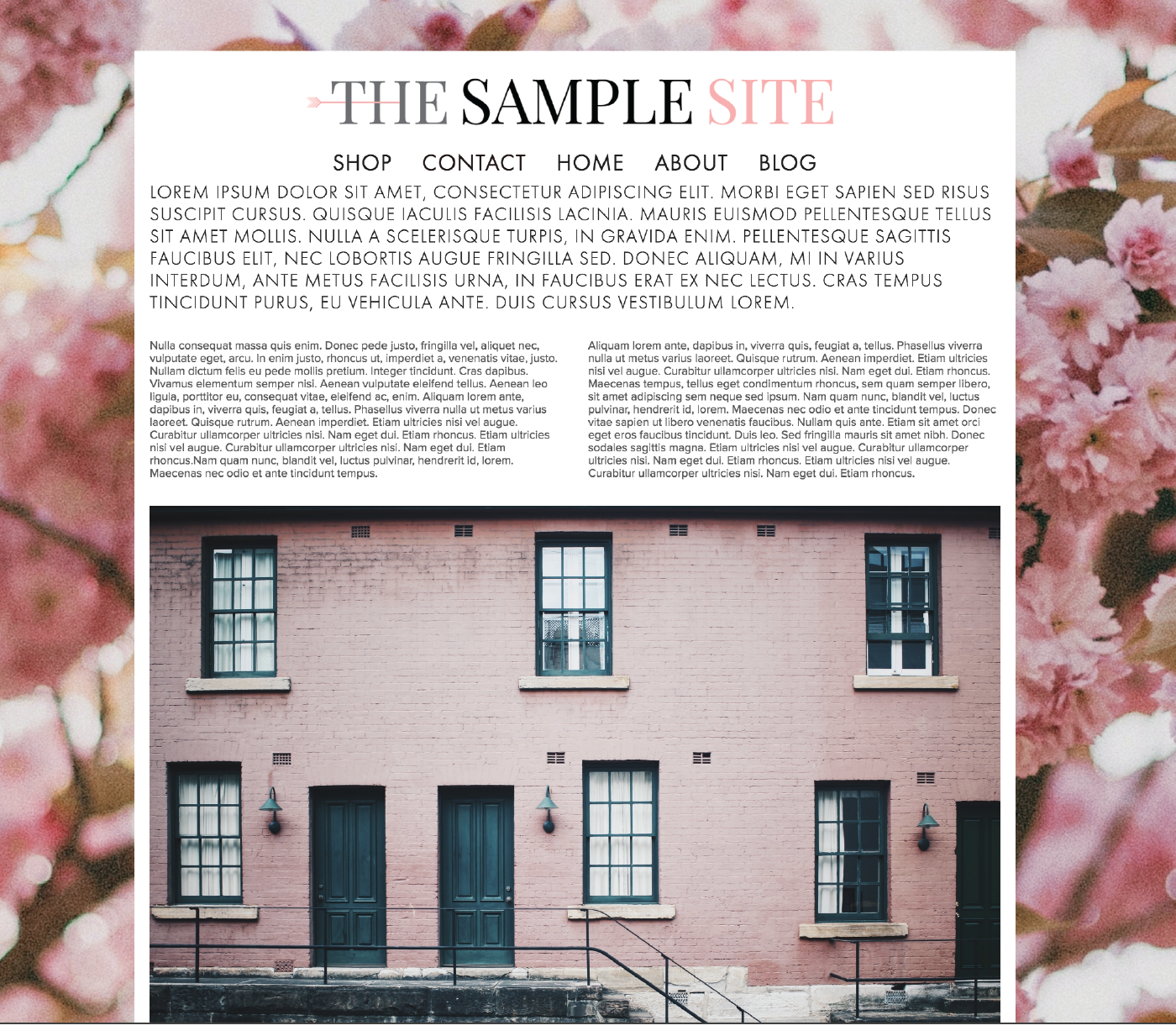
Images via Unsplash: Pink Building | Pink Florals
How do you feel when you look at this page? Possibly overwhelmed? Everything is squished together and there’s no room for your eye to rest. The background image is busy and the logo, navigation and text is uncomfortably tight. It kinda gives me a bit of anxiety and if I visited a page that looked like this, I’d hit the back button so fast. It’s too much.
EXAMPLE 2:

This second example is more inviting. Why? Because of the white space! You’ll notice there is space between the logo and the navigation bar, and between the navigation bar and the body of the website. Not to mention the spacing of the body text: both between the letters and the lines. You probably feel a little more inclined to start reading the text in this version as opposed to the first (except for the fact that it’s placeholder text called lorem ipsum and is not actually readable :)
2 • PHOTOS
Photos are invaluable to your website’s success. When is the last time you came across a website with dark or fuzzy images? Maybe the color looked “off”? Even if photos on a site are bright, clear and have great color, they might have too much going on or may simply be irrelevant. What about the background? Is it clear or distracting? Depending on your site’s platform, images can also look skewed if the dimensions aren’t just right. (Side note: Squarespace keeps the dimension of your photos equal so when you resize an image, the proportions are always the same which means no skewed images. Thanks Squarespace.)
If you find yourself needing help with your images, here are some tips:
- Crop out extra background “noise” or anything that distracts from what you’re wanting to feature.
- Only include photos that are relevant to your product or service or brand.
- Remove dated pics. If your photo has someone wearing a style from 15 years ago, you may find you attract the wrong clients or customers.
- Brighten your photos with an app such as Afterlight, or in Photoshop.
- Use quality stock photos. Google “stock photos” and download images that are free for commercial use, or buy a few. Please note: it is illegal to use photos that don’t belong to you. Be sure to read and understand the usage rights provided on any stock photo website you visit and only use images you have permission to use.
3 • QUALITY WRITING
This is difficult. Not many of us feel that we are naturally good writers—I certainly don’t! It often feels awkward to write my thoughts for anyone and everyone to see. I’ve ripped out many pages from my old journals and Hello Kitty diaries over the years because I simply could not handle reading those ridiculous thoughts I wrote in junior high, high school, or even college. Who am I kidding, I’ve also shredded pages that were written well past my college years. I completely embarrass myself.
But whether you like to write or not, words are necessary when you're creating a website. Highlighting a process or service, adding an about page, or a creating a blog post requires writing.
Here are a few quick tips to consider when writing your copy:
- Avoid fluff and unnecessary words. For example, here are two ways to say the same thing:
Sentence A: Try to avoid fluff and remove any unnecessary words that take you longer to get to your point.
Sentence B: Avoid fluff and get to the point.
Right? Short sentences often make the biggest impact. You want your personality and character to show in your writing so don’t be too brief or robotic-sounding, but do edit. (I’m naturally long-winded so this is particularly hard for me.)
- Use spell check. We all make spelling and grammatical errors every now and then, but if these mistakes are a regular occurrence in your writing, it will inevitably become part of your brand. And not in a good way. So edit! I’ve heard numerous times that you should spend more time editing than you spent writing.
- Use editing software. Grammarly or Hemingway Editor are great, free options.
- Ask a friend or family member to edit for you. You’ll obviously want to ask someone who writes well themselves and understands the correct way to use a semicolon :)
- If you can afford it, hire an editor. Or if you’re hiring a designer for your website, ask if she has an editing option...some designers do the editing as an add-on service when designing your site. And if not, she may be able to recommend someone who can edit.
4 • FONTS
As much as you may want to use a cute script handwritten-type font for the copy on your site, it’s important to think strategically and realistically about the color, style, and size of your fonts. First of all, do you spend hours writing posts for your blog so that people will say “cute font”? Probably not. Don’t let font colors or style distract from the words themselves. You want to use an easy to read font that is an appropriate size and color. Here’s an example of a page with a decorative font that is not very legible.

5 • COHESIVE STYLE
Creating a cohesive style for your website is not only fun, but it sends a message that you are professional and thoughtful in your approach to business. Some ways to make your website look “put together” are with fonts, colors, buttons, and brand elements.
- Fonts: Choose two fonts that work nicely together, usually a serif and a sans serif that complement each other. Use an easy to read font for the body text and something equally easy to read, but with a contrasting look for the headings.
- Colors: If you don’t already have a color palette from your designer, choose a few colors and find the hex codes for them so you can add them throughout your site. Squarespace makes this easy with their Style Editor. If you don’t know what a hex code is, you can find out more on Squarespace’s Color page.
- Button Style: Choose a button size and style in Squarespace and keep the same size and style consistent throughout your site.
- Brand Elements: Use brand elements such as a submark, texture or shapes to make each page feel like it belongs with the others.
6 • CLEAR NAVIGATION
Your navigation bar is the table of contents for your site. It is usually located at the top or the side of your website and lists the pages you have on your site. Things to consider with your Navigation Bar are:
- Titles: Each navigation link is a page title. Make sure they are understandable. You may be tempted to be cute and creative with the words you use, but the navigation bar is not the best place for that. When you have a guest visiting your site, you want her to know exactly where to go and how to find out more about what you do. Navigation titles like “Work With Me” or “Services” are clear and understandable. Versus something like “How Can I Help You” or “Get This Party Started".
- Limit Choices: Make it easy for your visitor to find what they are looking for. You want her to know what her options are without overwhelming. Usually five links is ideal. The important but non-critical links such as Shipping Policies or FAQs would do well at the bottom of the page in the footer, and Contact, Services, and Shop would be best at the top in the main navigation bar.
7 • CONTACT INFO
If you are a brick and mortar business like a shop or cafe, keep your physical address in the footer so visitors don’t have to go to your contact page to figure out where you’re located.
Provide a contact form or an email address where people can send you an email directly from your website. Ideally both. That way if someone is on your site but doesn’t have time to write out her message to you then and there, she can save your email address and send you a message from her own email account when she has more time.
8 • SOCIAL MEDIA
Add all of your main social media accounts to your footer or header so they’re easily clickable from any page on your site. You never know exactly when something you have on your site will resonate with a particular person, so giving direct access to your social media links is a good idea, no matter what page they are on. This is standard in Squarespace if you set-up your Connected Accounts.
9 • LINKS
New Window: When linking to a page that is not part of your website, be sure you are directing it to open in a new window. Whether it’s a link that is providing credit for a photo you used, a link to a recommended book you just read, a link to your social media accounts, anything. Anytime you have a link that takes you to another website it should open into it’s own tab or page so your page stays open in your visitor's browser. Otherwise, your links will steer readers away from your website and they may never find their way back.
- Blog post links: I recently read Emily Henderson’s “What Goes Into a Blog Post” post. Love her so much. Anyway, she had a whole post on how her team creates a blog post and all the effort that goes into it. One of the many tidbits I got from her post was the idea of back links. It’s basically going back into old posts and linking to newer posts. I know it’s a thing, I’ve heard about it before, but she made it so approachable and normal. For example, if you wrote a blog post two months ago highlighting your favorite dining tables, and are now writing about dining chairs, you might consider going back to the original dining table post and linking to your new dining chair post and vice-versa. This not only keeps visitors on your site longer, but it provides value to your readers because you're giving them an easy reference to learn more about a subject they're interested in. It also adds new life to your older posts which might otherwise have been lost in blog land.
10 • CALL TO ACTION
A few weeks ago I was helping a friend tweak her Squarespace website and realized the link to purchase her product was hidden behind an invisible rollover. There was no way to see the "shop" link unless you rolled over a certain part of the site just-so, or clicked the box in the upper corner for the navigation bar drop-down.
Not good! A home page filled with beautiful product photos is worthless if your visitors can't easily access the purchase page. In this case, we added a Shop Now link right dab in the middle of the page —in a strategic and visually pleasing way, of course. Now, when her customers visit her site, they can easily click to access her product page and make a purchase.
You want your site to be beautiful, but it also needs to make you money. Be sure to provide an easily accessible link that prompts your visitors to take action.
• • • • • • • • • • • • • • • • • • • • • • • • • • • • • • • •
What do you think? Are there things on this list that you will start working on to make your site more user friendly and effective? I'm still figuring out the editing piece, myself. It takes lots of time and I'm never quite satisfied, but those apps I mentioned have been helping. I hope this was helpful and as always, let me know if you have any questions.