Practice Recommendation: Magazine Illustrations

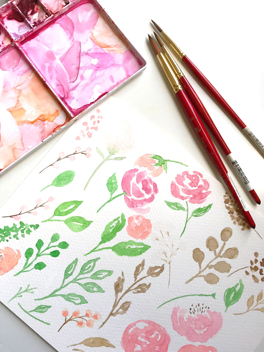
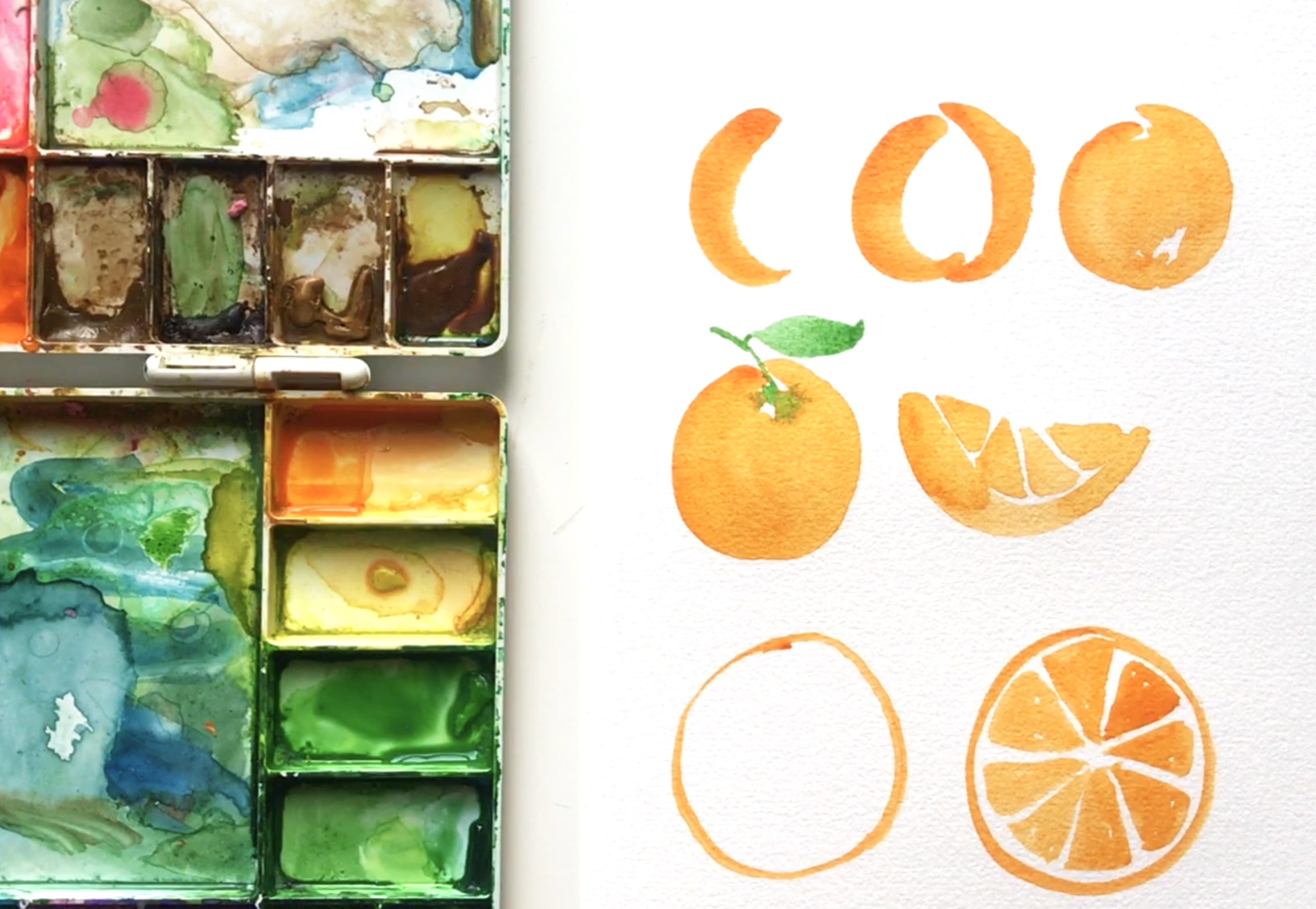
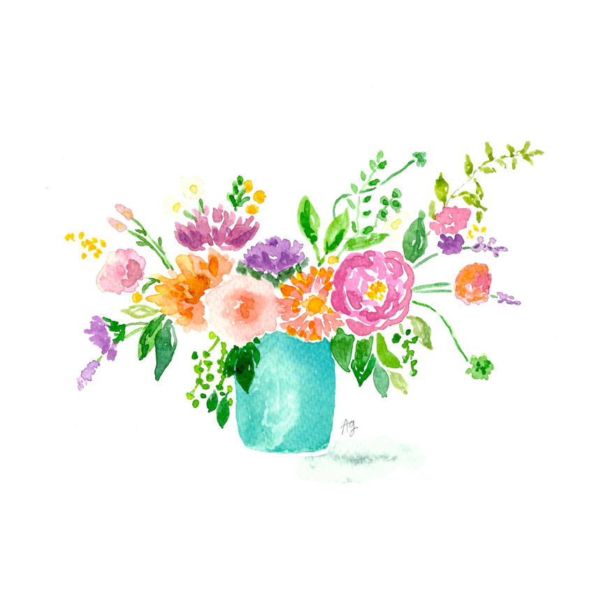
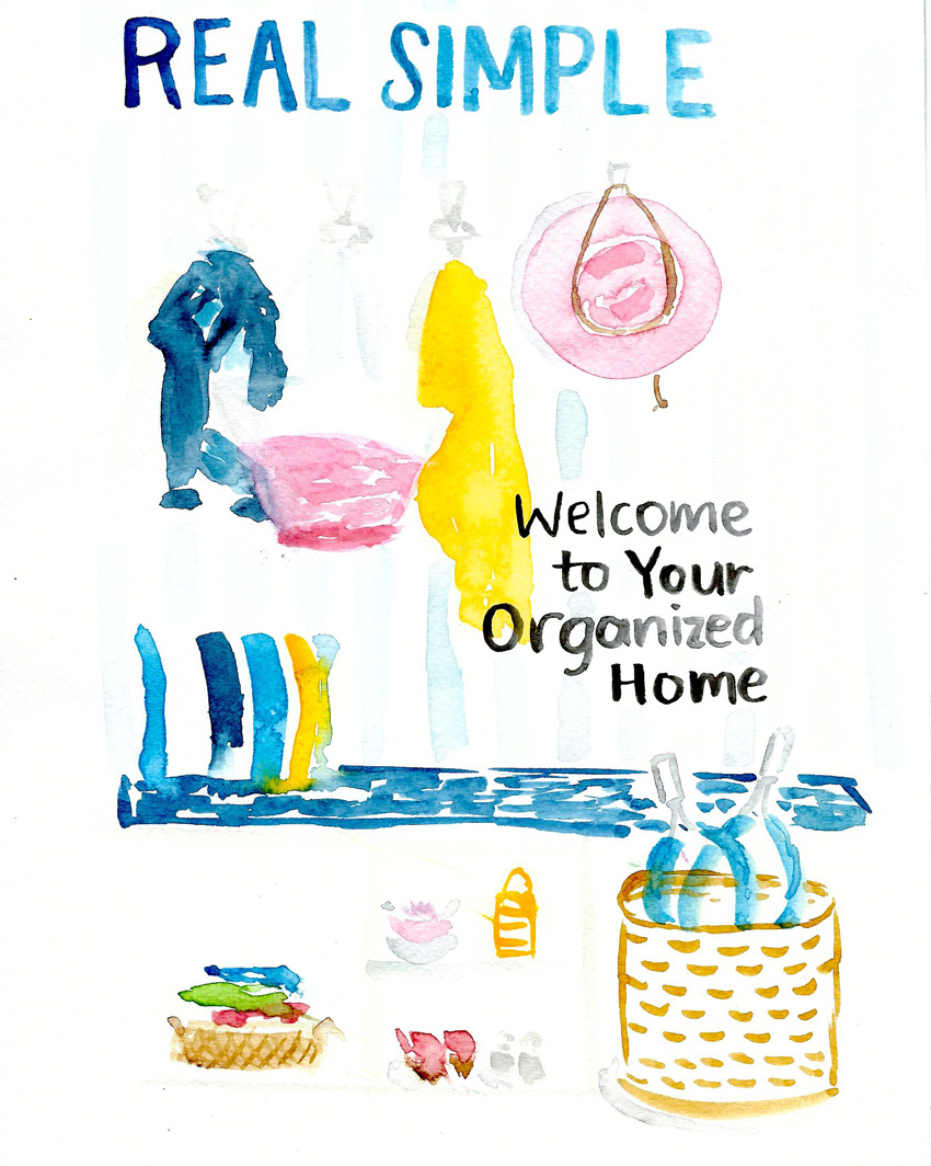
If you follow me on Instagram, you may have seen me post these practice illustrations in my Stories. I've been wanting to get better at watercolor illustrations because I typically default to painting florals and fruit so I chose four magazine covers and painted them in a fairly quick style over four days. I took about 30-60 min for each. I wasn't aiming for perfect (clearly!), but instead I wanted to get the idea across and get a feel for sketching a space.

I'd love to be more comfortable painting a range of subjects, including people, animals, furniture, houses, etc. and these cover paintings are such a good idea. They have a variety of elements on each cover which make me consider depth and angles as well as figuring out how to "paint white" by leaving areas empty and painting around the white parts. There's the lettering aspect too which is fun! I'm going to continue this practice even though I probably won't keep sharing them...and I recommend you try too if you're in the same boat. Have fun!

Day 1: Real Simple

Watercolor Practice Idea: use magazine covers for lots of illustration elements
Real Simple Magazine Cover Sept 2017

Day 2: Better Homes & Gardens

Watercolor Practice Idea: use magazine covers for lots of illustration elements

Day 3: Sunset

Watercolor Practice Idea: use magazine covers for lots of illustration elements

Day 4: House Beautiful

Watercolor Practice Idea: use magazine covers for lots of illustration elements

Day 5: Martha Stewart Living

Watercolor Practice Idea: use magazine covers for lots of illustration elements

Painting to Pattern: My Process

I'm a curious type who asks lots of questions in hopes of finding out how things work, why they're done the way they are, and how little things fit into a bigger picture. And since I have a fairly standard process when it comes to how I create a surface pattern from my watercolor art, I thought I'd share for you other curious types. So here it is...

Paint-to-pattern-design-process-amanda-gomes-delightedco.jpg

When I'm creating patterns, I usually have a color palette in mind and paint in those particular colors. There are ways to change the colors in Illustrator or Photoshop but when possible, I prefer to keep my designs pretty true to the colors I use when I originally create them.

I'll usually find floral images in a book, on Pinterest or from photos I've taken around town and use them for inspiration. When I paint fruit, however, I typically do a google image search because I can see multiple colors and variations of a piece of fruit in one place which is super helpful.

Last week I worked on this pattern:

©Amanda Gomes • Watercolor Floral Pattern

Which started as these individual motifs:

My process for turning my painted (watercolor) elements into patterns. ©Amanda Gomes • delightedco.com

I then scanned at 600 dpi using the software that came with my scanner (not an amazing scanner by the way, but it works: HP Officejet Pro 6830). I selected separate motifs and made new layers from each so I could edit them one by one. I edit the levels, remove the paper background and any dust spots, smooth edges if necessary, brighten or adjust color, and sometimes remove or add part of the painted motifs if their shape needs a little help.

Amanda-Gomes-Watercolor-Pattern-Process-2.jpg

Each motif is then transferred as a separate element into Illustrator. For this particular pattern, I made mini bouquets from the elements and then laid out those bouquets to create my final design. I tried out a few background colors and then saved the few I liked best. And that's it!

My process for turning my painted (watercolor) elements into patterns. ©Amanda Gomes • delightedco.com