Reflection and News

Here I am with my family last fall thanks to a fun photo shoot with the amazing Pictilio team. I’ve officially been a full-time mom for a year and can’t believe how fast the time has gone.

Amanda Gomes Design Family Photo by Pictilio and Shop News

It’s been a great year, although it started off pretty rough. Let’s just say I was not feeling accomplished day-to-day as a mom the same way I was in my office job. ;) But I've slowly come to a place of resetting my expectations, and even though there are days I could scream (and do), I’m truly enjoying being with my kiddos and love having so much time to discover, snuggle and play with them. They’re growing too quickly and I’m grateful to have this time with them.

I’ve also officially been painting for a year now and I'm so happy to have found something I enjoy so much. Thank YOU for following along as I share my work…it seriously means a lot that you read my posts, leave comments on Instagram, and encourage me as I go. I appreciate you.

I often get asked when I find time to work on my art when I’m home with the kids, and the answer is that I mostly paint and pattern in the evenings, early mornings or for an hour or so during the day when the kids are occupied with legos or a video, but I also have all day Wednesdays to myself, thanks to my in-laws, so that’s a dream.

On a related note, you may have seen me post about my shop that will be opening in a couple weeks, and because of that, I decided to use my own name (Amanda Gomes) online instead of Delighted Creative Co. "Delighted" came from Delighted Magazine, which I published from 2012-2014 and featured things that delighted me: interviews with small business owners, stories from moms, recipes, tutorials, and lots of other fun things. (If you’d like a peek at past issues, click HERE). In a couple of days I’ll be transitioning to my new account, so if you start seeing posts in your Instagram feed from amandagomesdesign, that's me! 😊

Thank you again for being part of my creative journey!

Coming Soon: an online Shop!

Guess what!? In the next few weeks, I'll be launching a shop, right here on my website, where you can find goodies featuring my watercolor work! To begin, I'll have stationery, art prints, and a couple other fun items.

Speaking of fun items, here's a sneak peek at some zipper pouches that will be available. I had some of my patterns printed on linen cotton canvas and am so excited about how they came out. I think you'll love them too! I'm only making about a dozen of these and don't plan on stocking more so if you'd like one, be sure to follow me on Instagram for updates or join my email list (and get free downloads while you're at it!) to find out when they'll be available.

Stay tuned...

Zipper Pouches designed by Amanda Gomes • amandagomes.com

CUSTOM PAINTING GIVEAWAY

Fun news! For the next few days, you can email or DM me a photo or quote you'd like me to paint for you.  Your home, your pet, a hand-lettered quote, painted florals, ...or something else! Send me your photo (the photo must belong to you) and I'll choose three photos or quotes to paint from in the month of October. If your photo or quote is chosen and you're in the US, you'll get an 8x10 original painting (unframed) sent to you in early November. If you're outside the US, you'll receive an electronic file that you can have printed locally.

Photos/quotes need to be submitted by this Sunday, October 8.

Email hello [at] delightedco.com
Direct Message me via instagram.com/delightedco

Amanda Gomes Art  • Custom Painting Giveaway

My Work: Recent Sketches

I've been experimenting with sketches adding background colors in watercolor and like the extra boldness it adds to my work. I don't know if I'll make it a regular thing, but it's been fun to try.

The biggest struggle is knowing how to paint the background without it looking too messy. Some strokes and puddles look cool and others, not so much. One tip I can share is that it's obviously easier to do the background with a larger round brush...so I used a size 10 brush. The wide part gives a nice swash and the round tip helps me get around the detail areas.

Here are some of the sketches. What do you think?

Amanda-Gomes-Illustration-Chair.jpg
Copyright Amanda Gomes • watercolor pink coat illustration
Copyright Amanda Gomes • Watercolor Cake Illustration
Copyright Amanda Gomes • plates watercolor illustration
Copyright Amanda Gomes • watercolor camellia illustration
Copyright Amanda Gomes • watercolor succulent illustration
Copyright Amanda Gomes  • Watercolor Floral Pattern


For more of my work, follow along on Instagram to see my daily sketches and patterns.

Practice Recommendation: Magazine Illustrations

If you follow me on Instagram, you may have seen me post these practice illustrations in my Stories. I've been wanting to get better at watercolor illustrations because I typically default to painting florals and fruit so I chose four magazine covers and painted them in a fairly quick style over four days. I took about 30-60 min for each. I wasn't aiming for perfect (clearly!), but instead I wanted to get the idea across and get a feel for sketching a space.

I'd love to be more comfortable painting a range of subjects, including people, animals, furniture, houses, etc. and these cover paintings are such a good idea. They have a variety of elements on each cover which make me consider depth and angles as well as figuring out how to "paint white" by leaving areas empty and painting around the white parts. There's the lettering aspect too which is fun! I'm going to continue this practice even though I probably won't keep sharing them...and I recommend you try too if you're in the same boat. Have fun!

Day 1: Real Simple

Watercolor Practice Idea: use magazine covers for lots of illustration elements
Real Simple Magazine Cover Sept 2017

Day 2: Better Homes & Gardens

Watercolor Practice Idea: use magazine covers for lots of illustration elements

Day 3: Sunset

Watercolor Practice Idea: use magazine covers for lots of illustration elements

Day 4: House Beautiful

Watercolor Practice Idea: use magazine covers for lots of illustration elements

Day 5: Martha Stewart Living

Watercolor Practice Idea: use magazine covers for lots of illustration elements

Painting to Pattern: My Process

I'm a curious type who asks lots of questions in hopes of finding out how things work, why they're done the way they are, and how little things fit into a bigger picture. And since I have a fairly standard process when it comes to how I create a surface pattern from my watercolor art, I thought I'd share for you other curious types. So here it is...

Paint-to-pattern-design-process-amanda-gomes-delightedco.jpg

When I'm creating patterns, I usually have a color palette in mind and paint in those particular colors. There are ways to change the colors in Illustrator or Photoshop but when possible, I prefer to keep my designs pretty true to the colors I use when I originally create them.

I'll usually find floral images in a book, on Pinterest or from photos I've taken around town and use them for inspiration. When I paint fruit, however, I typically do a google image search because I can see multiple colors and variations of a piece of fruit in one place which is super helpful.

Last week I worked on this pattern:

©Amanda Gomes • Watercolor Floral Pattern

Which started as these individual motifs:

My process for turning my painted (watercolor) elements into patterns. ©Amanda Gomes • delightedco.com

I then scanned at 600 dpi using the software that came with my scanner (not an amazing scanner by the way, but it works: HP Officejet Pro 6830). I selected separate motifs and made new layers from each so I could edit them one by one. I edit the levels, remove the paper background and any dust spots, smooth edges if necessary, brighten or adjust color, and sometimes remove or add part of the painted motifs if their shape needs a little help.

Amanda-Gomes-Watercolor-Pattern-Process-2.jpg

Each motif is then transferred as a separate element into Illustrator. For this particular pattern, I made mini bouquets from the elements and then laid out those bouquets to create my final design. I tried out a few background colors and then saved the few I liked best. And that's it!

My process for turning my painted (watercolor) elements into patterns. ©Amanda Gomes • delightedco.com

What I'm Learning: Watercolor Supplies

Ahh watercolor. It's been my favorite past time since officially discovering it last September (2016) thanks to Creativebug and Yao Cheng's Beginning Watercolor class.

After a year of watercolor painting, these are the supplies I recommend. A list of paper, watercolor paint, and brushes, along with links on where to find them.

I was on a 6-week sabbatical from work, home with a 3-year old and 1-year old, and had big plans to learn art, in some form or another. Just before my time off, I'd discovered Creativebug and set-up a secret pinterest board titled Art Exploration. I pinned a bunch of interesting classes and worked through a couple of them which were great, especially Lisa Congdon's drawing classes. See my recommended online courses HERE. (I also tried some oil painting on my own without any instruction and that was a disaster! I'll save that story for another time.)

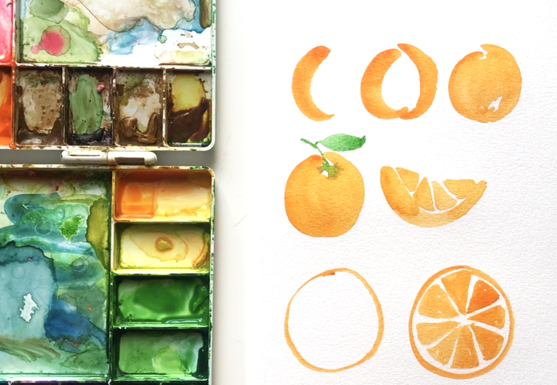
Then came time for me to press "play" on Yao's watercolor class. I watched it like a movie the first time through and knew I had to give it a try myself. I had two seriously old brushes, a $5 Michael's watercolor set, and no watercolor paper so I was anxious to get to an art store. I went to Blick and purchased the least expensive watercolor paper I could find, a size 6 paint brush (btw-who knew there was a difference between watercolor paintbrushes and oil paintbrushes!?), one tube of Winsor & Newton Professional Opera Rose paint, (one of Yao's favorite colors), and a 99-cent mixing palette. I was trying to make it as inexpensive as possible because I wasn't sure I would actually enjoy painting as much as I enjoyed watching Yao paint.

But I did! A week later I bought a Winsor & Newton Cotman pan set, a couple more brushes, and the inexpensive SKILL paper from Aaron Brothers and the Canson paper from Michael's. I found myself practicing all.the.time. I would either paint or draw (or both!) every single day for the duration of my sabbatical.

That was almost a year ago and since then, I've spent money on brushes I never use and paper that I don't love. If you're starting out and are wondering what you should buy to get started with watercolor, I'm hoping the recommended supplies listed below will offer some guidance and will make things a bit easier and affordable for you!
 

PAPER

90 lb Fabriano Studio Watercolor Paper, Cold Press (9x12) 
• I use this paper most; it's great for practice
• costs about 30-cents/page
• $6 for 20 pages at Blick
• $15 for 20 pages at Aaron Brothers so wait for their "buy 1, get 2 free sale"
• 25% cotton so it has a great feel but it's more lightweight so the paper will warp a bit, especially if you use lots of water

140 lb Fabriano Studio Watercolor (8x10)
• great for practice and original pieces
• costs about 42-cents/page
• $5 for 12 pages at Blick
• I use this paper when I'm working on something that will be hung on a wall, painting a landscape, or have a particular type of work in mind (vs. just sketching where I use the 90-lb)

BRUSHES

Princeton Heritage Round 4050R
• My favorite!!
• I use sizes 0-10 but my go-to's are 2, 4 and 8
• You can get these at Aaron Brothers (buy 1 get 2 free sales) or Amazon but the best price is definitely at Blick
• $3 - $8 each for those sizes at Blick

Princeton Select Synthetic Round 3750R
• I often use these for lettering (I don't prefer them for anything else)
• Sizes 5/0, 10/0, 0, 1
• Under $2 each for those sizes at Blick
• Note: the brushes on these are super thin and their shape can is easily lost if you snag the wrong way on your paper towel, or drop them, etc.
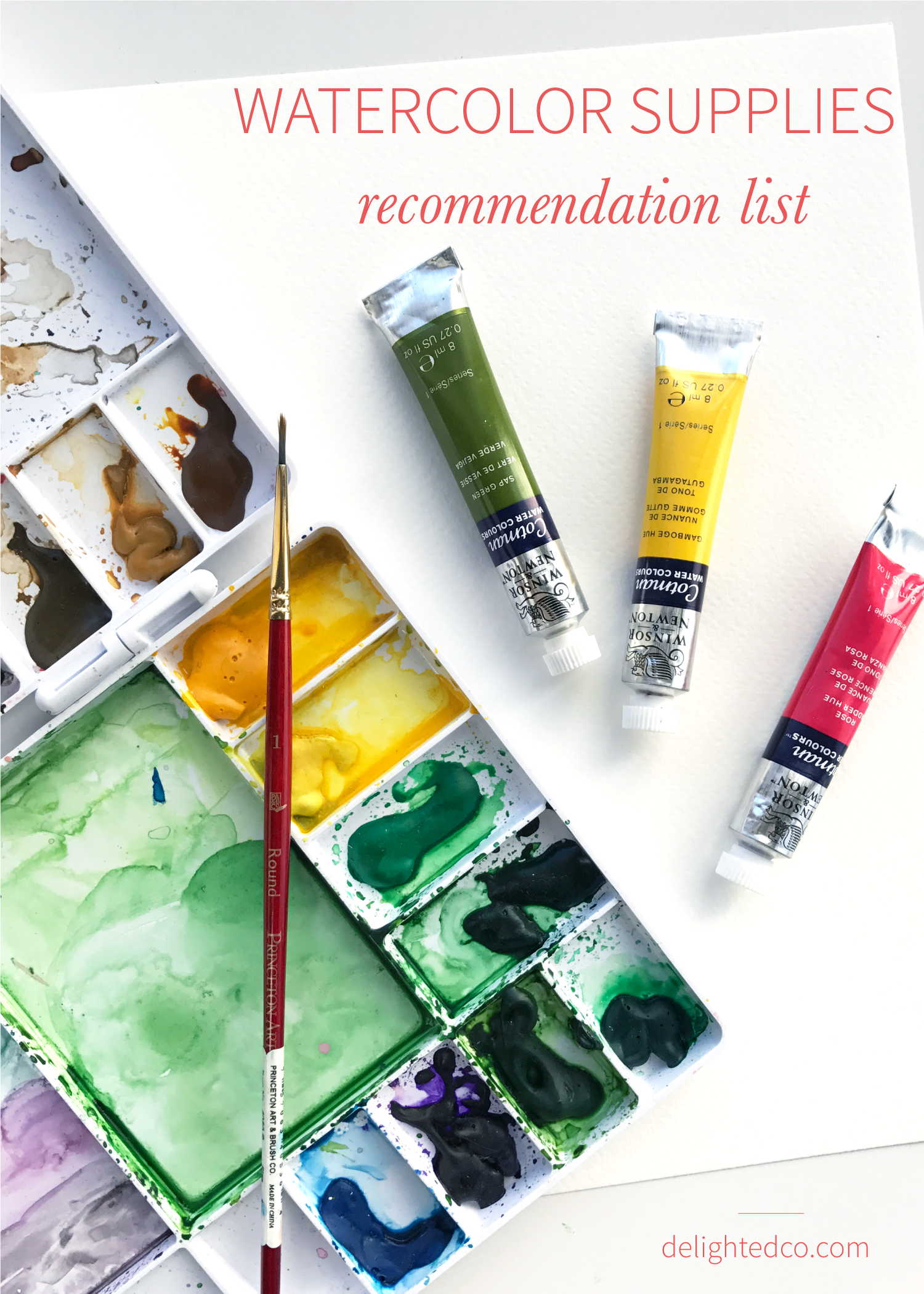
PAINT

Winsor & Newton Cotman Sketcher's Pocket Book
• Great for beginning and traveling! I used only this set with one tube of Opera Rose for quite a while
• $13 on Amazon
• This set comes with 12 colors, but if you want to start out with more options, they have a 24-color option as well

Winsor & Newton Tubes
• I mostly use Cotman tubes because they're very reasonable, but their colors aren't as vibrant as the professional paint
• $3 each at Blick
• I recommend splurging on Winsor & Newton Professional in Opera Rose (if you like pink)
• My go-to Cotman colors are: Prussian Blue, Permanent Rose, Cadmium Orange, Cadmium Yellow, Lemon Yellow, Hookers Green Light, Sap Green, Raw Umber, Ivory Black

Dr. Ph. Martin's Hydrus Fine Art Watercolor Set 1
• I haven't tried other brands of liquid watercolor or the concentrated versions so I can't compare but these are fun to use
• Bright, bold colors!
• $44 at Amazon or Blick

Artist's Loft Fundamentals Pan Set
• Great for beginning: especially if you're wanting to give watercolor a try and don't know if you'll be able to paint much
• Lots of bright colors
• $5 at Michael's
• This is the only thing I had in my house when I first started (I had purchased it a few years prior) but only used a couple times. I'll admit, I was influenced by the watercolor artists I was learning from and ended up giving this set to my daughter
• Since then, I've seen amazing artists use this set so I'm sure it's about preference and what one is used to. My only hesitation in recommending is that the paints feel a little chalky to me, whereas the Winsor & Newton or Dr. Ph. Martin's don't

And there you have it! I am sure I'll end up trying different paints and paper the longer I watercolor, but for now these are my best recommendations. I hope this is helpful...and have fun painting!