Recommendations: Podcasts

I am a podcast lover. Actually, I'm addicted and have been for a while now. It started circa 2010 when I discovered a marketing podcast and would listen when I had mindless things to do at work. Around that same time, my husband and I started listening to financial and family-oriented podcasts while we did housework in our studio and over the last couple years there have been some really fun new podcasts focused on creative businesses which have been helpful. I like that I can listen and learn on the go or whenever, really. Especially once I realized my phone has a podcast app...hello, duh. I can’t believe I didn’t know about it sooner.

Podcast Recommendations for Creative Entrepreneurs • delightedco.com

Anyway, I thought I’d share some of my favorite shows in case you’re in the market for some business wisdom, interviews and creative inspiration. These are listed in no particular order.

1   •   Creating Your Own Path: An Examination of Life + Creativity + Business

I love hearing from the guests that Jennifer Synder invites on her show. There are a few I already follow and know of, but many I’ve never heard about who I enjoy getting to know through their interviews. From artists to shop owners to musicians, Jennifer has a way of getting people to share their stories by asking the right questions and then letting them answer without interruption. The discussions really do reflect the title of the podcast because after every episode I have a sense of what the guest's path has been up to that point in their career and where it is headed.  ••LISTEN••

2  •   StartupCamp

My friend Candace from Pictilio introduced the StartupCamp podcast to me a few months ago and I’m so glad she did. The host, Dale Partridge, is exceptional at interviewing and makes each episode feel like time well spent. He asks the right questions and often shares bits of his own story to drive home certain points. Although there are some guests and topics that are not necessarily exciting to me, I gain helpful insights every time I tune in. Additionally, Dale’s website is full of great tips and essays on small business and life in general. I am a big fan.  ••LISTEN••

3  •   Make It Happen with Jen Carrington

This is my newest podcast discovery. Jen is a blogging coach and it is rare that she interviews someone I’ve heard of which I find pretty fun. It’s always nice to be introduced to people who are making things happen in their worlds and hearing how and what they are doing to build their business. I could be wrong but I think of it as more of a “young” podcast in that guests seem to mostly be in their 20’s. I love that young people straight out of college are starting their own online businesses these days.  ••LISTEN••

4  •   Being Boss

An all-around great podcast. I don’t listen to every episode, depending on the topic, but most of the time they’re great and Emily and Kathleen are fun hosts. Emily and Kathleen are creatives who provide website and branding services to their clients so their insights are right along the lines of what I’m interested in. They talk about things like client relationships, productivity, content creation, and interview creatives who share their journeys. They also have a community that anyone can be a part of via Facebook, or a paid community they call the Clubhouse where creatives can connect with each other. This is an all around great resource.  ••LISTEN••

5  •   Elise Gets Crafty

Elise Blaha Cripe interviews creative entrepreneurs in a very conversational way. She seems to be learning along with the listeners so she asks probing questions which mean we get to hear some great thoughts and gain helpful tips from people who are doing cool things in their industries. Her guests vary from fine artists to authors to makers. Listening to stories of where each came from and how they got to where they are is always intriguing and inspiring. This is a fun one. ••LISTEN••

I never turn away from hearing creative small business owners interviewed so I’d love to know if you have any other recommendations! :)

10 Things to Consider When Designing Your Website...and Why They're Important

Creating your space on the internet is both exciting and challenging. Your website is a place for your dream clients and customers to find out more about you and to hopefully do business with you, so you want to ensure that your site is not only beautiful, but practical, professional, and easy to navigate. It’s no small task! I still have things I want to do to my own site to improve it’s functionality and look, so I understand the struggle. Here are ten things to consider as you set up your new site or work to improve your current one.

Here are 10 things to consider when designing your website: 1. White Space 2. Photos 3. Good Writing 4. Fonts 5. Cohesion 6. Clear Navigation 7. Contact Info 8. Social Media 9. Links 10. Call to Action. Read more about each at delightedco.com/blog


1  •  WHITE SPACE

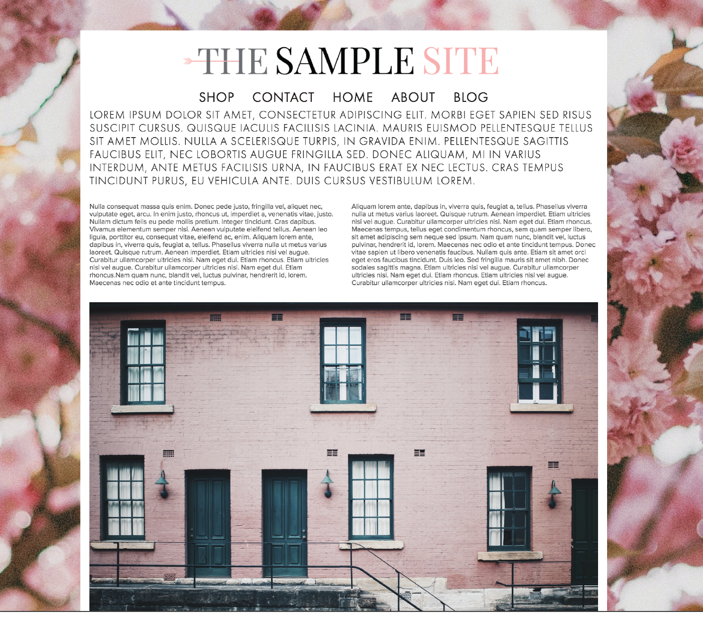
White space is like a breath of fresh air. It’s pretty much exactly what it sounds like: the blank space on your website that surrounds your text and images. It creates a clean and uncluttered feeling on your page and helps provide a sense of direction to your visitor. Look at the two examples below.

EXAMPLE 1:

Images via Unsplash: Pink Building | Pink Florals

Images via Unsplash: Pink Building | Pink Florals

How do you feel when you look at this page? Possibly overwhelmed? Everything is squished together and there’s no room for your eye to rest. The background image is busy and the logo, navigation and text is uncomfortably tight. It kinda gives me a bit of anxiety and if I visited a page that looked like this, I’d hit the back button so fast. It’s too much.

EXAMPLE 2:

10 Things To Consider When Creating Your Website. | Via DelightedCo.com

This second example is more inviting. Why? Because of the white space! You’ll notice there is space between the logo and the navigation bar, and between the navigation bar and the body of the website. Not to mention the spacing of the body text: both between the letters and the lines. You probably feel a little more inclined to start reading the text in this version as opposed to the first (except for the fact that it’s placeholder text called lorem ipsum and is not actually readable :)

2  •  PHOTOS

Photos are invaluable to your website’s success. When is the last time you came across a website with dark or fuzzy images? Maybe the color looked “off”? Even if photos on a site are bright, clear and have great color, they might have too much going on or may simply be irrelevant. What about the background? Is it clear or distracting? Depending on your site’s platform, images can also look skewed if the dimensions aren’t just right. (Side note: Squarespace keeps the dimension of your photos equal so when you resize an image, the proportions are always the same which means no skewed images. Thanks Squarespace.)

If you find yourself needing help with your images, here are some tips:

  • Crop out extra background “noise” or anything that distracts from what you’re wanting to feature.
  • Only include photos that are relevant to your product or service or brand.
  • Remove dated pics. If your photo has someone wearing a style from 15 years ago, you may find you attract the wrong clients or customers.
  • Brighten your photos with an app such as Afterlight, or in Photoshop.
  • Use quality stock photos. Google “stock photos” and download images that are free for commercial use, or buy a few. Please note: it is illegal to use photos that don’t belong to you. Be sure to read and understand the usage rights provided on any stock photo website you visit and only use images you have permission to use.

3  •  QUALITY WRITING

This is difficult. Not many of us feel that we are naturally good writers—I certainly don’t! It often feels awkward to write my thoughts for anyone and everyone to see. I’ve ripped out many pages from my old journals and Hello Kitty diaries over the years because I simply could not handle reading those ridiculous thoughts I wrote in junior high, high school, or even college. Who am I kidding, I’ve also shredded pages that were written well past my college years. I completely embarrass myself.

But whether you like to write or not, words are necessary when you're creating a website. Highlighting a process or service, adding an about page, or a creating a blog post requires writing.

Here are a few quick tips to consider when writing your copy:

  • Avoid fluff and unnecessary words. For example, here are two ways to say the same thing:

Sentence A: Try to avoid fluff and remove any unnecessary words that take you longer to get to your point.

Sentence B: Avoid fluff and get to the point.

Right? Short sentences often make the biggest impact. You want your personality and character to show in your writing so don’t be too brief or robotic-sounding, but do edit. (I’m naturally long-winded so this is particularly hard for me.)

  • Use spell check. We all make spelling and grammatical errors every now and then, but if these mistakes are a regular occurrence in your writing, it will inevitably become part of your brand. And not in a good way. So edit! I’ve heard numerous times that you should spend more time editing than you spent writing.
  • Use editing software. Grammarly or Hemingway Editor are great, free options.
  • Ask a friend or family member to edit for you. You’ll obviously want to ask someone who writes well themselves and understands the correct way to use a semicolon :)
  • If you can afford it, hire an editor. Or if you’re hiring a designer for your website, ask if she has an editing option...some designers do the editing as an add-on service when designing your site. And if not, she may be able to recommend someone who can edit.

4  •  FONTS

As much as you may want to use a cute script handwritten-type font for the copy on your site, it’s important to think strategically and realistically about the color, style, and size of your fonts. First of all, do you spend hours writing posts for your blog so that people will say “cute font”? Probably not. Don’t let font colors or style distract from the words themselves. You want to use an easy to read font that is an appropriate size and color. Here’s an example of a page with a decorative font that is not very legible.

10 Things to Consider When Creating Your Website. #4: Clear Fonts | via delightedco.com

5  •  COHESIVE STYLE

Creating a cohesive style for your website is not only fun, but it sends a message that you are professional and thoughtful in your approach to business. Some ways to make your website look “put together” are with fonts, colors, buttons, and brand elements.

  • Fonts: Choose two fonts that work nicely together, usually a serif and a sans serif that complement each other. Use an easy to read font for the body text and something equally easy to read, but with a contrasting look for the headings.
  • Colors: If you don’t already have a color palette from your designer, choose a few colors and find the hex codes for them so you can add them throughout your site. Squarespace makes this easy with their Style Editor. If you don’t know what a hex code is, you can find out more on Squarespace’s Color page.
  • Button Style: Choose a button size and style in Squarespace and keep the same size and style consistent throughout your site.
  • Brand Elements: Use brand elements such as a submark, texture or shapes to make each page feel like it belongs with the others.

6  •  CLEAR NAVIGATION

Your navigation bar is the table of contents for your site. It is usually located at the top or the side of your website and lists the pages you have on your site. Things to consider with your Navigation Bar are:

  • Titles: Each navigation link is a page title. Make sure they are understandable. You may be tempted to be cute and creative with the words you use, but the navigation bar is not the best place for that. When you have a guest visiting your site, you want her to know exactly where to go and how to find out more about what you do. Navigation titles like “Work With Me” or “Services” are clear and understandable. Versus something like “How Can I Help You” or “Get This Party Started".
  • Limit Choices: Make it easy for your visitor to find what they are looking for. You want her to know what her options are without overwhelming. Usually five links is ideal. The important but non-critical links such as Shipping Policies or FAQs would do well at the bottom of the page in the footer, and Contact, Services, and Shop would be best at the top in the main navigation bar.

7  •  CONTACT INFO

If you are a brick and mortar business like a shop or cafe, keep your physical address in the footer so visitors don’t have to go to your contact page to figure out where you’re located.

Provide a contact form or an email address where people can send you an email directly from your website. Ideally both. That way if someone is on your site but doesn’t have time to write out her message to you then and there, she can save your email address and send you a message from her own email account when she has more time.

8  •  SOCIAL MEDIA

Add all of your main social media accounts to your footer or header so they’re easily clickable from any page on your site. You never know exactly when something you have on your site will resonate with a particular person, so giving direct access to your social media links is a good idea, no matter what page they are on. This is standard in Squarespace if you set-up your Connected Accounts.

9  •  LINKS

  • New Window: When linking to a page that is not part of your website, be sure you are directing it to open in a new window. Whether it’s a link that is providing credit for a photo you used, a link to a recommended book you just read, a link to your social media accounts, anything. Anytime you have a link that takes you to another website it should open into it’s own tab or page so your page stays open in your visitor's browser. Otherwise, your links will steer readers away from your website and they may never find their way back.

  • Blog post links: I recently read Emily Henderson’s “What Goes Into a Blog Post” post. Love her so much. Anyway, she had a whole post on how her team creates a blog post and all the effort that goes into it. One of the many tidbits I got from her post was the idea of back links. It’s basically going back into old posts and linking to newer posts. I know it’s a thing, I’ve heard about it before, but she made it so approachable and normal. For example, if you wrote a blog post two months ago highlighting your favorite dining tables, and are now writing about dining chairs, you might consider going back to the original dining table post and linking to your new dining chair post and vice-versa. This not only keeps visitors on your site longer, but it provides value to your readers because you're giving them an easy reference to learn more about a subject they're interested in. It also adds new life to your older posts which might otherwise have been lost in blog land.

10  •  CALL TO ACTION

A few weeks ago I was helping a friend tweak her Squarespace website and realized the link to purchase her product was hidden behind an invisible rollover. There was no way to see the "shop" link unless you rolled over a certain part of the site just-so, or clicked the box in the upper corner for the navigation bar drop-down. 

Not good! A home page filled with beautiful product photos is worthless if your visitors can't easily access the purchase page. In this case, we added a Shop Now link right dab in the middle of the page —in a strategic and visually pleasing way, of course. Now, when her customers visit her site, they can easily click to access her product page and make a purchase.

You want your site to be beautiful, but it also needs to make you money. Be sure to provide an easily accessible link that prompts your visitors to take action.

• • • • • • • • • • • • • • • • • • • • • • • • • • • • • • • •

What do you think? Are there things on this list that you will start working on to make your site more user friendly and effective? I'm still figuring out the editing piece, myself. It takes lots of time and I'm never quite satisfied, but those apps I mentioned have been helping. I hope this was helpful and as always, let me know if you have any questions.

What I'm Learning: 3 Online Resources that Helped Me Improve My Brand Design Process

Ahh...the world of brand identity and graphic design. There is so much to learn and I’m forever taking it in and refining my process for the better with each new project.

Three online resources that helped me improve my brand identity design process • Delighted Creative Co.

I didn’t go to school for design, although sometimes I wish I had. My first taste of graphic design was in a middle school “Advanced Tech” class (hello Macintosh SE) and a computer arts class where we used some sort of drawing software to make “computer art” all period long, every day. As much as I enjoyed these classes, I never considered Graphic Design as a career. Instead I majored in Communication studies with an emphasis in Advertising and Public Relations. I did take Graphic Design for Advertising, Desktop Publishing, and a few other design-related courses, but to me, these were bonus classes and I never thought I’d use graphic design skills regularly in my work.

However, that’s exactly what I ended up doing. Not on a large scale, but for projects here and there, in all of my jobs since college. When I worked in a hotel sales office, I designed fliers and email promotions for travel industry partners. In my job at the wedding magazine, I helped our designer with the magazine layout and designed ads for clients as well as promotional pieces for our brand. In my job at an architecture studio I worked on multi-page marketing proposals, and in my current role I design invitations, agendas or other event collateral. I truly enjoy these projects and am glad (and a little surprised) those initial design classes turned out to be so useful.

Because I have more workplace experience than classroom experience, I am intrigued by graphic designers with four-year degrees who are freelancing full-time or working at a design studio. They have been through grueling coursework, peer reviews, and have taken classes like Art History, Color, and Typography. Because they've experienced a depth of learning in this field that I haven't, I am always looking to discover their secrets and best practices.

Thankfully we have the opportunity to learn pretty much anything, anytime, anywhere from experts in most fields. Insightful podcasters freely share their knowledge, online classes taught by masters of their crafts are available from the comfort of our homes, and online communities allow us to learn from amazingly talented people.

I have taken advantage of my fair share of podcast episodes...daily storing away gems of knowledge. I purchase classes from designers I respect, and am part of online forums where I’ve been able to learn from designers and small-business owners with a deep knowledge and expertise. These podcasts, classes, and forums are inspiring and super helpful as I am working towards developing my own design process and expertise.

If you are in a similar situation, wanting to learn best practices from designers online, here are three of my favorite design-related educational investments and why I recommend them.

Skillshare Brand Identity Design Course Recommendation by Delighted Creative Co.

SKILLSHARE

I can’t get enough of this site. One of the first courses I took on Skillshare was Courtney Eliseo’s class called Beyond the Logo: Crafting a Brand Identity. It was a total game changer for me. My eyes were opened to the world of brand design and this course made everything “click”. I had been designing for a while and knew there was more to a logo than the logo itself, and I knew about complementary fonts, submarks and brand guidelines, but wasn’t sure how to put all those pieces together. After her class, it made sense. Getting a behind-the-scenes peek at her full brand creation process was beyond helpful as I started working on brand identity projects myself.

My top two takeaways from this course:

1  •  The Client Questionnaire. After reviewing Courtney’s questionnaire, I was able to better understand the importance of a clear and well thought out client questionnaire. The questionnaire part of the branding process is the foundation for the design because it gets to the heart of the company and it’s owner. The more detail and thought a client puts into her answers, the better equipped a designer is to create an identity that reflects the client and her dream customers. I now have an in-depth questionnaire of my own that I’ve found helps me get to know my clients and their needs. And that is what ultimately helps me design a logo that is both beautiful and meaningful.

2  •  Logo Option Mockups. Courtney recommends using mockups to show logo options to her clients. For example, she will create a sample postcard or notecard with the logo and pattern she’s designed so her client can see the possibilities the logo provides. This might be something standard in the industry, but for me it was new and something I started implementing right away.

Be Free, Lance: An Online Course for Freelance Designers | Recommended by Delighted Creative Co.

BE FREE, LANCE

Breanna of Rowan Made and Jen of Serafini Creative have an e-course called Be Free, Lance which is a place for designers to learn the ins-and-outs of freelance. With content based on their years of experience as designers, the course provides an inside look at their processes and provides insights on everything from setting goals to getting clients to client management.

Included with the purchase of the course is an invitation to the private Facebook group which I’ve found to be the most valuable Facebook group I am part of (I’m in a handful of them). If you’re a designer wanting to learn from other designers, you’ll find lots of great info in this group. Not to mention that Breanna and Jen are very active and answer questions all the time which is so helpful.

Be Free, Lance now has Mini Courses which are great as well. I joined “The Branding Process” mini course which provides a detailed overview of Breanna and Jen’s branding processes. The examples and downloads provided are super helpful as I continually refine my own process.

My top two takeaways from this course:

1  •  Brand Strategy Overviews. It has been my experience that small business clients can often benefit from having a written brand strategy that outlines who they are, who their clients are, and what their business is about. After learning the way Breanna puts a strategy together for her clients, I have been able to adapt and do something similar for mine. It’s amazing how much it centers the project and gets my client and me on the same page before the design begins.

2  •  Provide a Maximum of 2-3 Logo Options.  Every designer needs to figure out what works for her when it comes to how many logos she provides to her clients: one option, two or three options, or 10 options! I've struggled to find the right amount with my clients until recently.

Sean McCabe of seanwes (one of my favorite podcasts), says something like: "your client is paying you to come up with a solution. Don't have her do your work by making her choose from multiple options. Create a solution and give it to her." He strongly believes in the one option scenario.

There are others who send their clients 8-12 logo options. That's a lot! I've done it this way a couple of times and it was fun because I had plenty of ideas and really liked how they were looking and feeling. But if I'm figuring out what works for my client and why, I need to do the work of narrowing down the number of choices and provide her with the best solution. Thanks in part to the Branding Mini Course, I am understanding the strategic part of design even more and will be sticking with providing 2-3 options that will work best for my client and explaining why those options are best.


Freelance Wisdom: Client Branding 101 eBook Recommendation from Delighted Creative Co.

CLIENT BRANDING 101 EBOOK

Jess Levitz of June Letters Studio wrote an eBook called Freelance Wisdom: Client Branding 101 which was another great buy. I bought her eBook at a point where I had a pretty good idea of how I liked working with clients, but wanted another perspective. Jess has been freelancing for a few years and has a great style, so the opportunity to look into her design process was really helpful.

The eBook is a 40-page download and if you buy the expanded version, you can also get moodboard templates and a sample questionnaire. As I mentioned, the client questionnaire is key to the success of a brand identity project and it’s always fun to have a peek at the questions other designers use to get to know their clients.

My top two takeaways from this eBook:

1  •  Grayscale Logo Options. Jess provides logo options to clients in grayscale. She says doing so keeps her clients from being distracted by colors and instead makes it easier for clients to give meaningful feedback on the logo itself as well as to do side-by-side comparisons with the other options. I have heard mixed thoughts on this but knowing she uses the grayscale option for her clients has me giving it a second thought. I will likely try this in the near future.

2  •  Sketch Over a Couple of Days. Jess recommends putting aside two days for sketching logo ideas. She carries a sketchbook wherever she goes during this phase of the design process and will take it out when she sees something that sparks an idea. Instead of limiting myself to a few hours for sketching and concept creation, I may try this more organic process and give myself two full days to sketch as inspiration comes throughout the day.

So while I have yet to put all of these best practices into place, I appreciate the opportunity to expand my view on the way the branding process can work by learning from other experts in the design field. Each process is different with the same end result: a great brand identity that reflects the client and the client’s ideal customer.

Isn’t it amazing what we are able to learn from each other online? Let me know if you have a favorite online design course or eBook...I’d love to check it out!

20 Reasons to Use Squarespace for Your Website

Choosing a platform for your website is a big decision. When I started Delighted Magazine in 2012, I was using Blogger. And even though I had a custom URL to make it seem more legit, it was still Blogger which only has so much functionality. I was regularly frustrated when it came to customizing and felt like I had to learn things through a lot of trial and error versus having clear instructions and an understanding of how the program actually worked. But it was free and was good enough. Until I discovered Squarespace, thanks to my sister. I gave it a try and I haven’t looked back.

Chances are, you’re wondering if Squarespace might be the right solution for your website—and it just might. Here are 20 reasons to give it a try!

Are you wondering if Squarespace might be the right platform for your website? Here are 20 great things Squarespace offers. | From Delighted Creative Co.

1  •  Simple but Beautiful Design

It’s pretty clear that Squarespace is designed by people who know what they’re doing when it comes to design. Their layouts provide plenty of whitespace and padding where necessary so your website looks professional and has “room to breathe”. There are various styles but every one of them is designed in a clean, structured way that is ideal for showcasing your work and adding customizations to reflect your company’s style. A company whose overall aesthetic is clear and pretty to look at is a definite plus.

2  •  Templates

Each template offers different features and variations. For instance, the navigation bar location, whether or not it has blog capabilities, the footer style, and so on. Squarespace offers a description and feature list for each and every template so you can compare and decide which works for you.

As you’re trying to figure out what template works for you, you have the option of loading more than one template on your site as you’re building it, and do a “test run” where you see how a certain template will look with your content. This is a great way to get a feel for different options. For time’s sake, I recommend first deciding what features you think you’ll need. Consider the look you like, the content you’ll be providing, the what your ideal client or customer may be looking for in terms of their experience on your site, whether or not you need a blog, and if so, will you need a sidebar? Once you have answers to those basic questions, review the template options and visit the sample websites that use the templates you’re interested in so you can see the template in action on a real-life website.  

Use these questions as a starting point to figure out what template will work best for you:

  1. Do you want a blog? If so, do you need a sidebar for your blog where you can have category links, an “about me” section, a search bar, etc?

  2. Do you want a website where all of your information is on one page? Or do you prefer a home page with links that direct your clients and customers to other pages on your site?

  3. Will you be selling products directly from your website?

  4. Will you be adding a lot of photos and portfolio work?

  5. Do you only need a landing page?

The Squarespace Help Guide offers additional info as you’re going through the decision process. If you’re feeling stuck, you can reach out to the Squarespace team for suggestions. They ask that you answer some basic questions for them and they’ll direct you towards some great options for your needs.

20 Reasons to Consider Squarespace for Your Website from Delighted Creative Co.

3  •  No Coding Required

It’s like a dream come true: you can have a beautiful, professional website without needing to know even one line of code. As you’re setting up your website, keep in mind that there are some limitations with what you can do to your site without code because you’re working within the boundaries of a template. If you love a particular feature from your favorite website or blog that was created from scratch on a platform using CSS and HTML, you may be frustrated when it’s not possible to recreate. For instance, a colored footer may not be an option with the template you chose. But don’t be! Consider your visitor’s needs and focus on how they’ll be using your site and rest easy knowing that for most websites, what Squarespace offers is more than enough.

The features and options in Squarespace have been well thought out and their process for adding content is super simple. I’m quite certain you will be pleased, if not ecstatic, with the final layout of your site. A place online that is all yours—and it’s easy!

4  •  CSS Can Be Added for Customization

If you do need a few customizations or if you know CSS and want to change your template at all, you can! I have limited CSS knowledge but did make a couple changes to my site using code. As an example, hover over any of the images on my site and you’ll see the Pin It button is unique. I designed the button in Illustrator and used code I purchased to add it to all of my images.

5  •  Adding Content

Squarespace uses an intuitive block system that allows you to build your website by adding blocks on your page and choosing what you want that block to do. Do you want an introduction paragraph? Insert a text block and start typing. An image? Insert an image block and upload your image. A space for your social media buttons? Insert a social media block and connect your accounts. Easy! Each content addition gives you a feeling of accomplishment.

6  •  Ease of Creating and Editing

The simplicity and intuitive-nature of Squarespace is probably one of it’s best features. Considering that most websites are constantly being updated with new content, it’s important to use a platform that makes editing and adding a simple task. Do you want to add an image? Okay, choose the image block, upload, add the description, maybe a caption, make it a link to anywhere, and Save. Simple! Do you want to add a newsletter subscription sign-up form? Place the newsletter block on your page, add your mailchimp credentials, and you’re all set!

7  •  Customer Service

Wow. The customer service Squarespace provides is amazing. Open a ticket via email or chat and you will have a friendly answer to your question within 24-hours or so. The customer service is ah-mazing.

8  •  Tutorials and Help Boards

On top of their great customer service, Squarespace has endless tutorials with clear instructions and has captured them in a super organized way. If something isn’t addressed in their tutorial pages, you will likely be able to get help via Squarespace Answers, which is a peer-to-peer community for anyone using their platform.

9  •  Price

Squarespace offers different pricing tiers which currently range from $5 to $40 per month depending on your business needs. The sites I have designed have all been between $5 and $26 per month. You can do a side-by-side comparison of the options for each price range and see what works best for you.

20 Reasons to Consider Using Squarespace for Your Website from Delighted Creative Co.

10  •  They Thought of Everything

From social media links to forms to inserting dividing lines to adding a video, it’s all a possibility with Squarespace. Yes, there are certainly some limitations, but for the most part, if you need something included on your site, you’ll be able to add it. And if you happen to know how to code, you can always use the code box to add unique content as necessary.

11  •  Built-in Tools

There are a number of tools that are built into the Squarespace platform that eliminate extra work. An example of these tools are the favicon uploader, photo descriptions, site information, and logo header. In the case of the favicon, for example, you don’t have to use a favicon generator or create a file that is exactly the right size for a favicon. Instead, Squarespace allows you to upload your image and it will add it as a favicon for you.

12  •  Sell Products

I don’t sell products on my site, but if I ever decide to, Squarespace has e-commerce options that will allow me to sell directly from my website. Some of the extra features they offer for e-commerce sites include shipping label services, inventory tracking, and accounting services.

13  •  Contributors

If you collaborate on blog posts or work as part of a team, you can provide permission to others to collaborate or contribute to your website by editing or adding new content depending on the authority you provide to them. This is helpful when you need someone on your team to add images to your gallery, or make changes to a page, or add extra items to your shop, etc.

14   •  Photo Resizing and Editing

You can resize your photos and even edit them directly in Squarespace! Talk about streamlining. I will say, I rarely use their photo editing option because the images I add to my site are ready-to-use when I bring them in, but knowing that I can tweak any image by brightening or cropping if I need to, is super valuable.

20 Reasons to Consider Squarespace for Your Website from Delighted Creative Co.

15  •  A Custom Domain is Included

When you purchase an annual subscription, your domain name is included! As long as the URL you want is available, you can request it directly through Squarespace. This means you don’t need to purchase your URL separately and connect it, although if you do have a domain already registered elsewhere, it’s easy to direct it to Squarespace, of course.

16  •  Hosting is Included

Squarespace hosts your website so you don’t need to pay for a hosting service. This is ideal because everything is connected and seamless.

17  •  Professional Gmail Account

Depending on the plan you choose, a Gmail account with your domain name may be included and if so, it can easily be set-up via Squarespace.

18  •  Content Transfer

You can transfer your content from Blogger, Tumblr or WordPress into your new Squarespace account and you can transfer your products from Big Cartel, Etsy, and Shopify. In true Squarespace fashion, step-by-step instructions are provided on their help pages so you aren’t left trying to figure it out on your own.

19  •  Responsive Website

A responsive website is one where the content on your website is created to fit and look just as great on a computer as it is on a mobile device. The content is scaled, resized and in some cases, slightly rearranged depending on the device you’re using. Website developers typically code sites to be responsive, but if you’re not creating a website from scratch, there’s nothing to worry about: Squarespace has taken care of it for you. Their sites are designed and built to work well and look great on any device you are using. There are some tips and considerations to keep in mind when laying out photos and content so that you get the best results, but Squarespace has tutorials to show you how to best do that.

And as you are building your site, you are able to view a demo version of your site as it would be seen on a tablet or smartphone.

20  •  Free Trial

You don’t have to pay to play. You can try Squarespace for two weeks, for free! You are able to build your site, see how you like the templates, add content, try their customer service, and review and and all of the tutorials without paying a dime. Once your two weeks are up, Squarespace will often allow you to extend your trial even longer if you’re not quite ready to commit. So keep checking your email for the extended offer or send an email to their customer service team with the request.

I hope this has been a helpful overview. Let me know if you have any questions that weren’t addressed or if you want more information on any of these benefits I mentioned. Have fun building your site!

Recent Work: J. Wade Public Relations

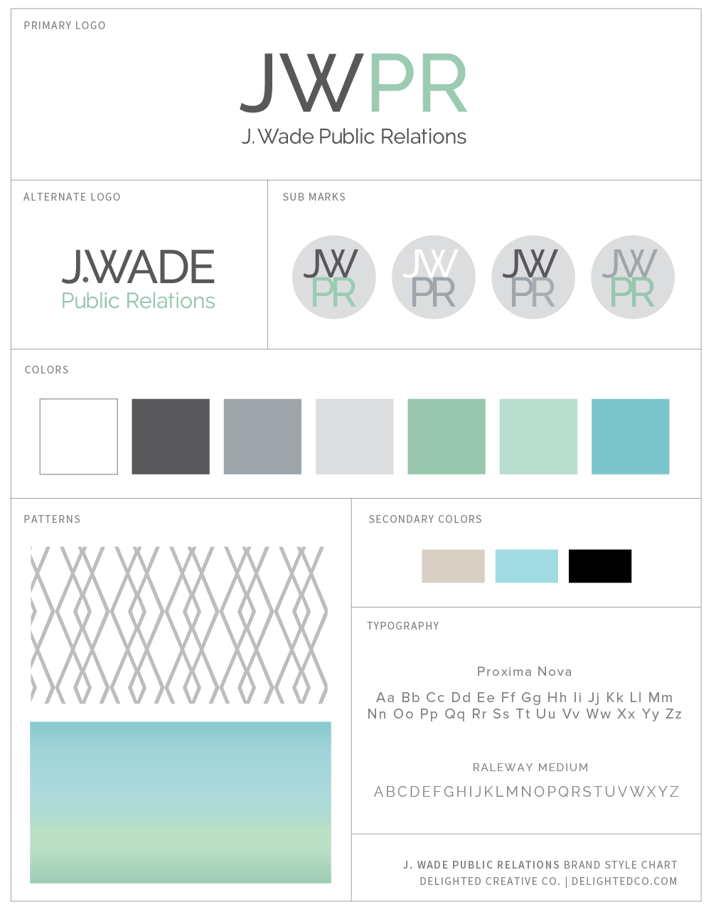
I had the pleasure of working on a new brand identity and website design project for Jenn Wade before maternity leave and I'm excited that her site is now up and running!

When we first connected, Jenn was in the process of starting her own PR firm and had a good idea of what she wanted: a brand identity and website that was modern and bold with personality. She and her team are seasoned experts in their field and have extensive experience to benefit their clients, which shows in her portfolio and in the broad range of services she provides.

Visit her website at jwadepr.com and let me know what you think!

Delighted Creative Co. Brand Style Guide #branding

If your small business is in need of a brand identity and website that tells your story, let's work on it together! Visit my Design Services page and send me a note to get started.

Giveaway: Just Jan's Gift Baskets

Happy Thanksgiving week!

Have you seen our Holiday Issue? It went live last week and is full of cool gift ideas, pretty spaces, travel inspiration...and a giveaway! Win four (4) Just Jan's Gift Baskets by entering below. And don't miss Jan's inspiring story on page 28.

DSC_0347.JPG
DSC_0036.JPG
DSC_0118.JPG

Interview with Jan Hogrewe of Just Jan's
Photos by Kelli Abrahamian

How did Just Jan’s come about?
After years in the film industry,  a light bulb moment happened for me after reading an article in “More” magazine (a magazine geared towards women over 40).  A featured article was profiling a high powered attorney who gave up a six-figure income to change gears and follow her passion into the next chapter of her life. I remember thinking, “I could do something like that.” I didn’t know what “that” was going to be.

What I did know was that I was happiest in the kitchen.  After my backyard Kadota Fig tree had exploded with fruit, I had to do something with the bounty.  Pots of fig jam were endlessly bubbling on my stove and I started giving away jars of the jam to family and friends. 

One of my friends especially loved the jam and introduced me to her friend in the food business. And that friend encouraged me to take steps to sell it. A bit of good fortune struck while we were meeting for lunch one day. A woman at the next table overheard our jam conversation and she happened to be a food buyer for a national store and asked to try my products. She loved the jam and was interested in selling it.

From that moment, it’s been a whirlwind of activity and learning. I’ve made so many great connections through word-of-mouth and cold calls and I now have 10 flavors available for purchase. Of course, my mind is always dreaming up something new.

What is unique about Just Jan’s jam?
My fruit spreads are lower in sugar with nothing extra added.  Just pure fruit flavor.  They are technically fruit spreads because of their low sugar content.  Lots of small-batch jam makers are making infusions of flavors, but I prefer to keep the recipes pure with fresh fruit flavor.  I make what I like.

What is your favorite flavor?
I usually say fig is my favorite flavor, but at the moment, my favorite flavor is my new Tangerine Marmalade. It pairs so well with fresh ricotta­­—any cheese really, in a vinaigrette, as a glaze on pork or chicken.

What is most popular with customers?
Our top sellers are the Seedless Raspberry, Kadota Fig and Meyer Lemon Curd. The creativity piece is what I love.  It took me twenty tries to get the lemon curd just the way I wanted it.

What has been the most rewarding part of starting your own business?
Taking my passion of creating food from a hobby to a real business. A business I love. Even as a young girl I enjoyed spending time in the kitchen. Now my work is in a kitchen and I love creating new recipes to share.

Can you tell us about your name: Just Jan’s?
I named the company “Just Jan’s” because I wanted the flexibility to make and sell more than just jam and fruit spreads.
When I shared the name with my mother, she smiled. My father died before I was born but he had told my mom that she was going to have a little girl. He said, “I want you to name her Jan. Just Jan.” I had forgotten that story but at that moment, I knew the name was very special.

What learning experience has helped you most to succeed?
I’ve learned to trust my gut, hold my breath and jump. Learning how to ask questions, do research, and put myself out there even if I get a “no” has been key. The whole creating and selling experience has helped me to get my groove back. You can’t help but succeed if you’re doing what you love every day. Now I can’t imagine doing anything else.

What advice can you offer others starting their own business at 50 and beyond?
Figure out what you’re passionate about. What gets you excited? At 50 we know what our gifts are and truly understand the concept of “if not now, when”? You will find doors that will open. Be comfortable with who you are as a person.  What do you have to lose?

Are you working on any new flavors or plans for the new year?
I am currently working on two new flavors.  One I call “Not just another strawberry” and also balsamic caramelized onions.  On the Just Jan’s website, we are always finding new ways to creatively use the products in recipes.  
I’ve also partnered with a cookie company on a new venture.  We make a shortbread thumbprint cookie mix and a baked cookie filled with my Meyer Lemon Curd and Seedless Raspberry Spread.  It’s exciting to come up with new ways to use fruit spreads. It’s not just for toast anymore!

*Giveaway open to US Residents