Painting Tutorial: Citrus Illustration

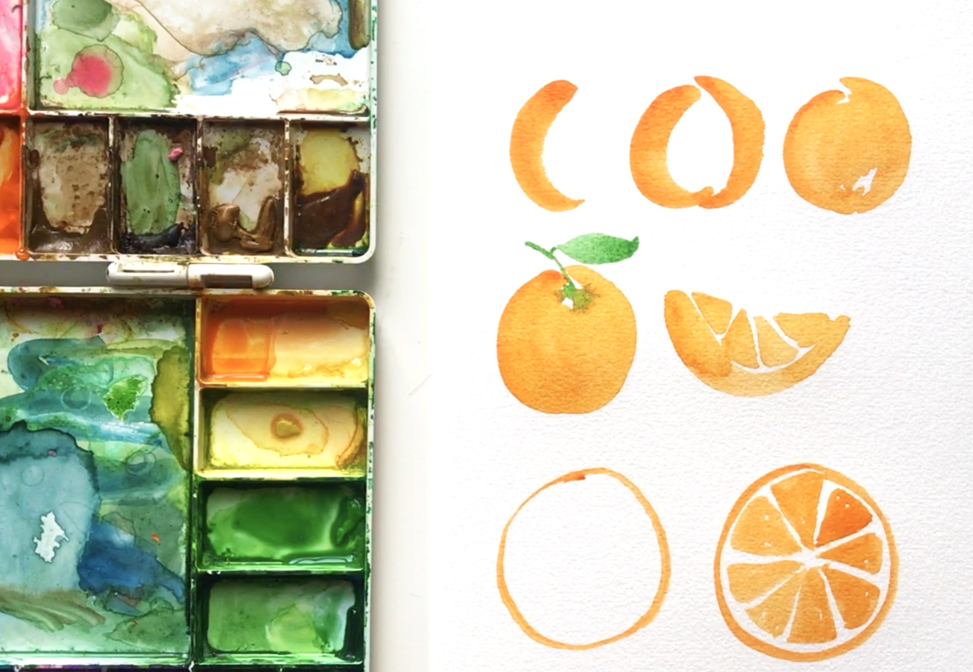
Another 1-min video tutorial today! I absolutely love painting fruit—especially citrus and I thikn you’ll find these oranges a lot of fun to paint. I hope you give it a try!

SUPPLIES

  • Orange and Green Watercolor Paint

  • 140 lb Bee Paper, Cold Pressed

  • Simply Simmons Round Brush, Size 8

  • Cup of water

  • Paper towel

STEP-BY-STEP

  • Fill your brush with paint and water (but make sure it’s not dripping wet)

  • Place the tip of the brush on the paper and apply pressure as you make the shape of a “c” (often called a comma stroke)

  • Add another comma stroke opposite the first and don’t quite join them at the top

  • Fill in the area with paint

  • Add a stem using just the tip of your brush

  • Add a leaf by joining two slight comma curves together and filling them in

Painting Tutorial: Watercolor Leaves

I learned to paint with watercolor thanks to the internet and lots of practice. I’m grateful for the artists who shared their talent and knowledge online because it allowed me to discover this creative outlet that’s made my life more fun.

If you want to get started with watercolor, here’s a quick 1-min video that will hopefully encourage you to give it a try. Step-by-step instructions are listed below. Let’s paint leaves!

SUPPLIES

  • Green Watercolor Paint
    - Winsor & Newton Cotman Sap Green
    - Winsor & Newton Cotman Hookers Green
    - Van Gogh Permanent Yellow Green

  • 140 lb Bee Paper, Cold Pressed

  • Simply Simmons Round Brush, Size 8

  • Cup of water

  • Paper towel

STEP-BY-STEP

  • Fill your brush with paint and water (but make sure it’s not dripping wet)

  • Start by placing the tip of the brush on the paper and apply pressure (press down) as you move the brush upward into a slight c-curve (often called a comma stroke), and lift the brush to finish

  • Do the same thing on the opposite side to make the other side of the leaf

  • Add a stem using the tip of your brush

  • Practice, practice, practice

  • And have fun!

How to Make a Repeat Pattern with Illustrator's Pattern Tool

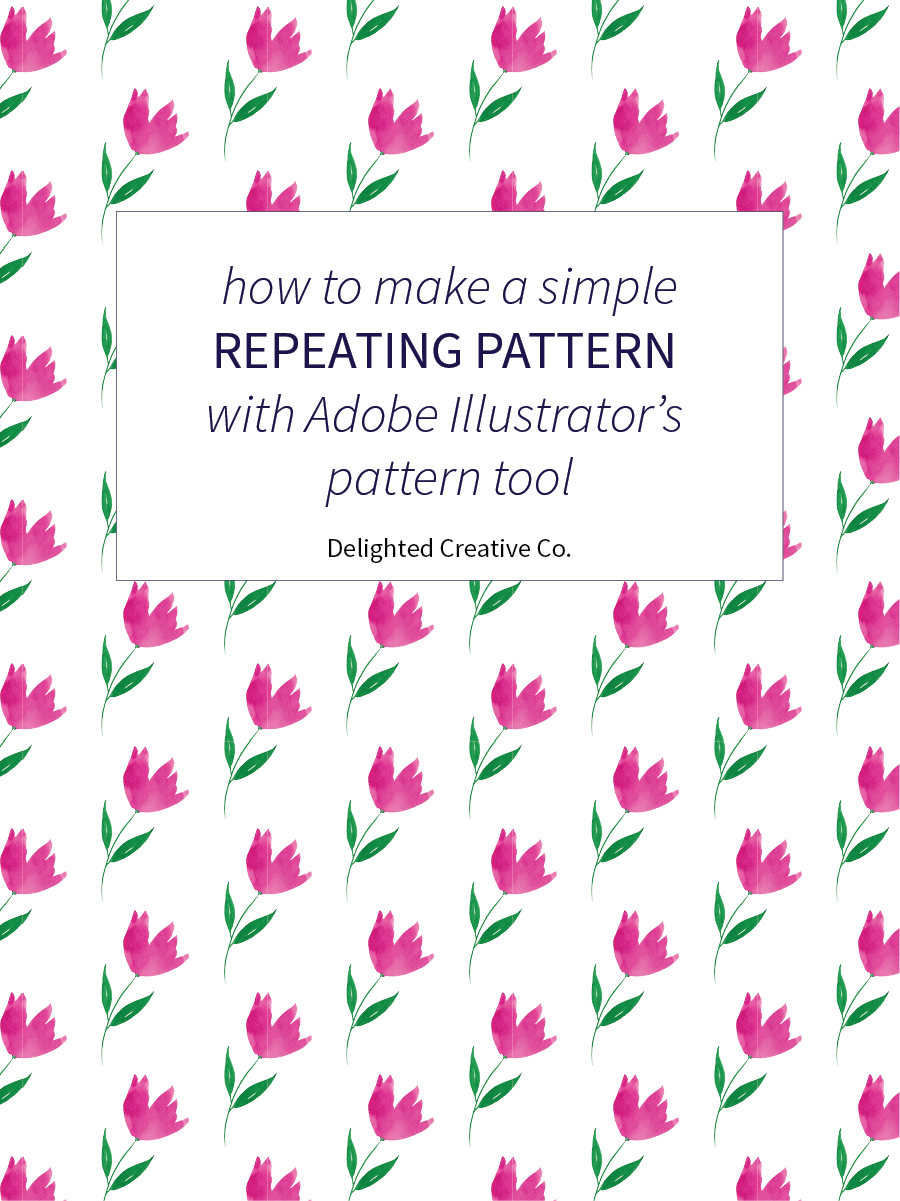
Somehow I completely forgot about Illustrator's built-in pattern tool and just rediscovered it for some simple repeats I've been making. This tool keeps equal spacing between motifs and I've found it to work best for fairly simple patterns and geometrics. It's fun to use because it seriously provides instant gratification. As in, you have a motif or element (such as the flower seen in my image below), and five seconds later you can have a pattern from that motif. If you haven't tried it, I think you'll love it.

How to make a simple repeating pattern using Adobe Illustrator's pattern tool  | Tutorial by Delighted Creative Co.

I created a quick 4-minute tutorial video to show you how to use the tool. I hope it's helpful and feel free to leave a comment below if you have any questions.

Have fun making patterns!

How to Draw a Wreath

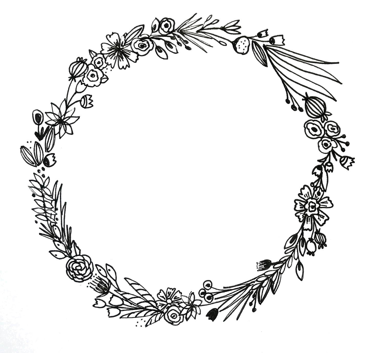
Wreaths! I am so glad I came across Surely Simple's Instagram account the other day because it inspired me to turn the floral motifs I sketch into wreaths. Pen and ink wreaths. It's an addicting activity and believe me when I say they look more intricate and difficult to draw than they actually are. The process is a lot of fun and I'm going to show you how to make one because I think you'll enjoy it!

How to draw a floral wreath...super easy and fun! Via delightedco.com

What you'll need:
• Paper
• Pen (I use micron pens but any will do)
• Pencil
• Something round for tracing

Start by sketching a few leaves and flowers which will give you something to reference as you create your wreath. I like to have motifs readily available to pull from so I don't have to overthink (which I'm prone to do). It also helps me move a little faster because I don't need to stop every few leaves to figure out what other elements I should add.

Learn to draw a floral wreath...super easy and fun! Via delightedco.com

Next, use a pencil to trace a round item such as a mug, jar, or whatever you have on hand.

Now use your pen and start drawing!

Start slowly and draw each motif, one by one. Try not to overthink (like I did my first few times) and instead, use your reference page to pull items and go around the ring. You can always fill in blank areas with dots or small leaves or florals after you fill the wreath once. If you're like me, you'll analyze your wreath like crazy so go ahead and take the time to learn from your first couple attempts and you'll keep getting better...I'm sure of it! Consider the following:

Spacing - Is there an area of the wreath where you have a bunch of motifs tight and squished together and other areas that are more sparse? Consider working on the spacing of your elements.

Balance - Mix the bold elements with the more delicate elements and consider the size of each motif. If some are extra large and others are small, make sure the large elements are dispersed around the wreath so it doesn't feel extra "heavy" in one area, making it seem off-balanced.

Visual Interest - do you have too many of the same elements in one section of the wreath? Is there variation between your motifs? Sometimes using all the same elements looks amazing and is just what you're going for, but make sure it looks intentional and that you try a mixture of shapes and angles around the wreath to keep the eye from settling on one overwhelming area.

How to draw a floral wreath...super easy and fun! Via delightedco.com

Have fun!

Links
A 45-second video of me drawing a floral wreath
Surely Simple's Instagram

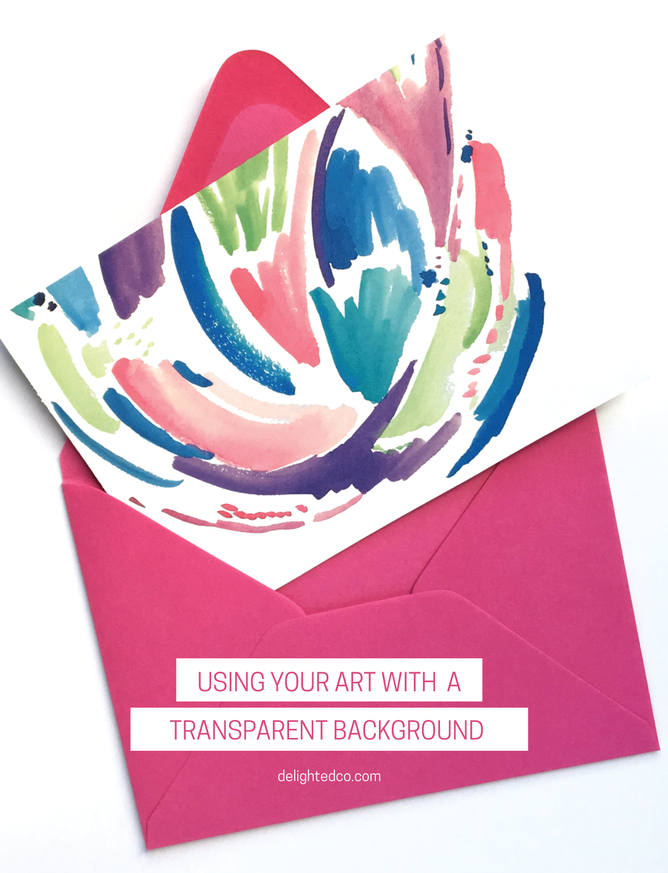
Ideas for Using Your Artwork with a Transparent Background

Last week I showed you how to bring your artwork into Photoshop and give it a transparent background. This week I want to give you a few ideas for using your artwork in Illustrator once you've removed the background.

Using Artwork With a Transparent Background in Illustrator • Delighted Creative Co.

You can:

1  •  Make a Note Card
2  •  Layer Your Art Over a Photo
3  •  Add a Block of Color Behind Your Artwork
4  •  Make a Repeating Pattern

Have fun!


Using Your Brand Colors in Microsoft Office Documents

If your brand identity has been created, you're excited to incorporate all of the beautiful elements into every part of your business (as you should be!). But what happens when you need to send a Microsoft Word document to a potential client and the only colors that seem available are Word's default colors? You might choose a color that kinda matches that sage color in your logo, or you might calculate how much it's going to cost to have your designer create the document for you, or you might say "piece of cake!" and use your exact brand colors to keep everything you send to clients seamlessly cohesive.

Do you want to learn how to add your brand colors into Microsoft Word and PowerPoint? This simple tutorial will show you how! Via Deilghted Creative Co. | delightedco.com

If you answered anything but the latter, read on. There is a simple process that will allow you to easily update your Microsoft Office documents with your brand colors.

Use Your Brand Style Guide

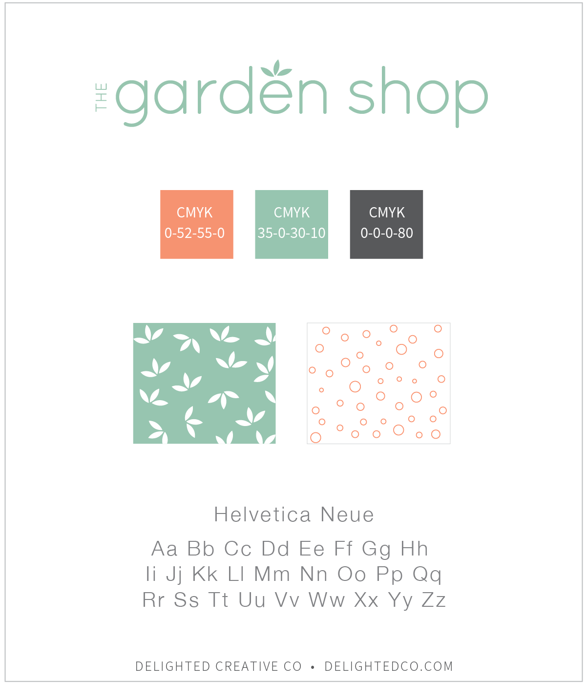
First, you will need your brand style guide as a reference. This is the information your designer creates and gives you when your brand identity is complete. For each color in your brand's color palette, the style guide provides either a CMYK, RGB, or HEX code—or all of the above. These codes provide you with color information you can use in most any program, including Microsoft Office programs. Your guide may look something like this:

Do you want to learn how to add your brand colors into Microsoft Word and PowerPoint? This simple tutorial will show you how! Via Deilghted Creative Co. | delightedco.com

The Five Steps

For the purpose of this tutorial, let's assume you have the CMYK color code for that sage green color you're looking for. In this instance, it's C-35, M-0, Y-30, K-10.

1 - Highlight the words in the document that you want to re-color
2 - On the Home tab, choose the "A" icon also known as the Font Color tool and click "More Colors..."
3 - In the Colors bar, choose the slider option and use the drop down to choose CMYK
4 - Type in the CMYK color code on your brand style guide and hit OK
5 - Ta da! Your type is now recolored to the exact color in your logo


1  •  Highlight the words in the document that you want to re-color

Adding Brand Colors to Microsoft Office || Delighted Creative Co.

2  •  On the Home tab, choose the "A" icon, also known as the Font Color tool and click "More Colors..."

Using Brand Colors in Microsoft Office || Delighted Creative Co.

3  •  In the Colors bar, choose the slider option and use the drop down to choose CMYK

Using Brand Colors in Microsoft Office || Delighted Creative Co.

4  •  Type in the CMYK color code on your brand style guide and hit OK

Using Brand Colors in Microsoft Office || Delighted Creative Co.

5  •  Ta da! Your type is now recolored to the exact color in your logo

Using Brand Colors in Microsoft Office || Delighted Creative Co.

And there you have it! Super simple.

• • • • • • • • • • • • • • • • • • • • • • • • • • • • • • • • •
Note: this works exactly the same in PowerPoint. Let me know if you have any questions.

How to Add a Favicon to Your Squarespace Website

When you're on a website, have you ever wondered about those little icons on the tab of your browser window? They add some fun to the tab and make a website seem complete—like a pretty stamp on an envelope. I always feel like something is missing when a site doesn't have one.

Learn how to create a favicon and add it to your Squarespace website. Click through for the 6 easy steps to add this small, but impactful detail to your site. | Tutorial by Delighted Creative Co.

As much as I notice them, and oddly care about them, there was a time when I didn’t know what they were called or how they got there. I had no idea how to build a website either so it didn’t really matter. But then I took an Adobe Dreamweaver class and was sitting by a girl who knew quite a bit about coding and website terminology. She seemed like the perfect person to get insights from. So I asked her.

“It's a favicon.”

“I'm sorry...a what?"

“Fav-i-con.”

“Oh, thank you. And how does it get there?”

“You have to add it.”

And she turned aside. So the conversation was over, but at least I knew what they were called—and I had Google.

Favicons. They’re tiny but impactful.

If you love details as much as I do and you want to be sure you don't miss an opportunity to brand your site in this way, I'll show you how to make one! It’s pretty straight forward and Squarespace makes it unbelievably easy to add to your website.

Let's get started. First, we'll talk about size and style parameters.

SIZE

Favicons are small with a final size of 32-pixels by 32-pixels. Because of the size, a simple design is ideal. Consider using a brand submark or the first letter of your logo or any symbol that you regularly use in your branding. Whatever it is, the less complicated the better. However—you should feel free to use something that's a bit complex if it fits nicely in a square area. For example, the Starbucks favicon in my round-up below is detailed, but works because it's not too tall or too wide.

STYLE

• Submark •
A great option is using a submark provided by your designer or any design that is clearly part of your brand identity. As I mentioned above, the most ideal favicons are simple and recognizable, considering they are quite small.

• Type, Shape and Color • 
If you don’t already have a submark that would work well, consider using a square block of color or a simple shape that reflects your brand: would a star, heart, diamond, or circle be applicable to your brand style? Or how about the initials of your company name? Here are some favicons to inspire you:

LET'S MAKE ONE!

I use Adobe Illustrator when I create favicons for myself or for my clients, but you can also use Photoshop, or Canva, which is free. Here is how I created the favicon for my site:

Step 1 • Open a new 100px square artboard in Illustrator

Step 2 • Create the shape you want as a background. I chose a circle, but again, choose what works best for your brand. There is no need to add a background shape if you don’t want one.

Step 3 • Type the letter(s) you want to include and resize to fit over the shape

Step 4 • File > Save For Web > Choose PNG > Type Optimized if you have text. If you want to remove the white background, check the Transparency box.

Step 5 • Navigate to your Squarespace account > Choose Design > Logo & Title

Create a Favicon for Your Squarespace Website | Tutorial by Delighted Creative Co @delightedco

Step 6 • Upload your Favicon and Save

And that’s it!

Note: it can take a few minutes for your favicon to show up—you may need to refresh your web browser a couple of times (Command + R), or even close it out and reopen.

Let me know if you have any questions!